silvi.ai
Landing Page Analysis
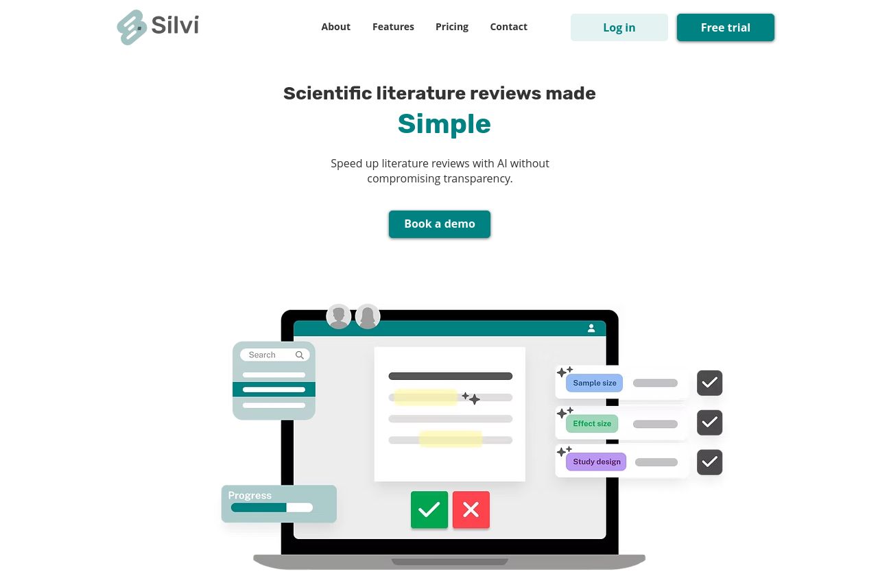
Do proper literature reviews much faster with Silvi by utilizing AI for screening and data extraction.
Summary:
Overall, the landing page does a good job visually but lacks depth in targeting the scientific and academic audience effectively.
There's a decent attempt to communicate the core value of speeding up literature reviews using AI, and words like "Simple" and "Speed" are emphasized correctly. However, these claims remain shallow without backing examples, data, or demo links.
While the main CTA "Book a demo" stands out, there's not enough engaging content leading to it. The imagery, though supportive, doesn't explicitly demonstrate product capabilities, which is a missed opportunity for scientists and academics craving precision and reliability.
The tone is professional but could be more authoritative by referencing peer-reviewed studies or industry standards, thus increasing credibility.
Unfortunately, the structure can feel disjointed, with repetitive claims and insufficient hierarchy, leaving users unsure of what to do next without heading for the scarce CTAs.
Social proof is there with a testimonial from "Henriette Kristensen," but again, it lacks variety and depth. Critical information on real-world usage scenarios or success stories is absent.
Navigation is quite basic, missing internal anchor links that could help users jump to relevant sections quickly, especially beneficial for an information-heavy audience.
- Add detailed case studies or examples to illustrate use cases for scientists.
- Improve visual hierarchy through better font differentiation and color emphasis.
- Incorporate more varied testimonials or third-party endorsements from reputable sources.