berisalam.net
Landing Page Analysis
64
Generated on:
July 3, 2025Score:
64/100Share on:
Summary:
60
Messaging
55
Readability
60
Structure
60
Actionability
50
Design
80
Credibility
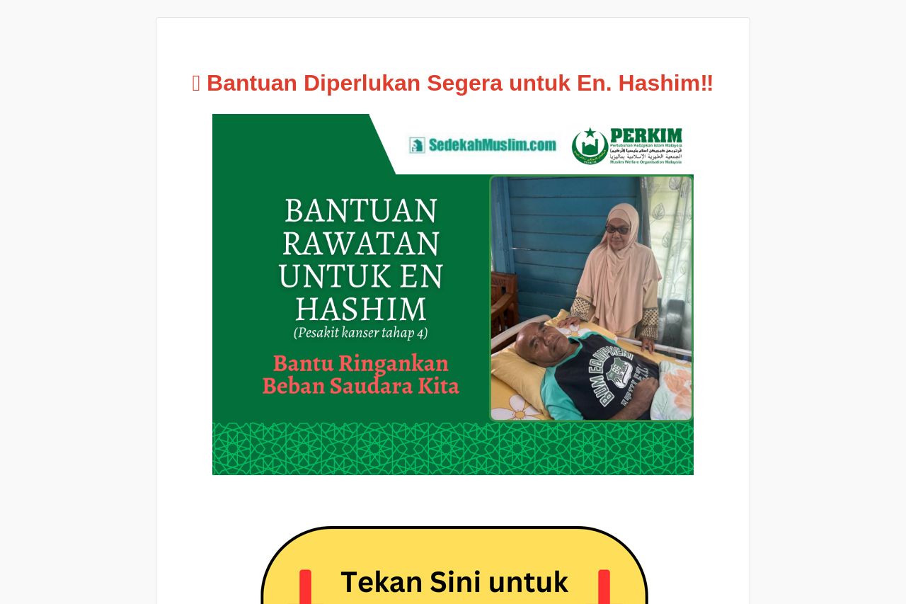
The landing page is emotionally charged, leveraging strong imagery and bold text to communicate urgency and need. However, the overall presentation risks overwhelming users due to inconsistent design choices like varying font sizes and colors. While the social proof of recent donations is a clever touch, the message hierarchy could be clearer, with critical calls to action obscured by dense text. The attempt to personalize the message with testimonials and a family story adds depth but is somewhat let down by a lack of cohesive narrative flow and clear, concise messaging in the content.
Main Recommendations:
- Simplify the textual content to improve readability and engagement.
- Establish a consistent font size and color scheme to improve focus and professionalism.
- Prominently place the main Call-to-Action in strategic areas to enhance user interaction.