auroinnovation.com
Landing Page Analysis
Home
Summary:
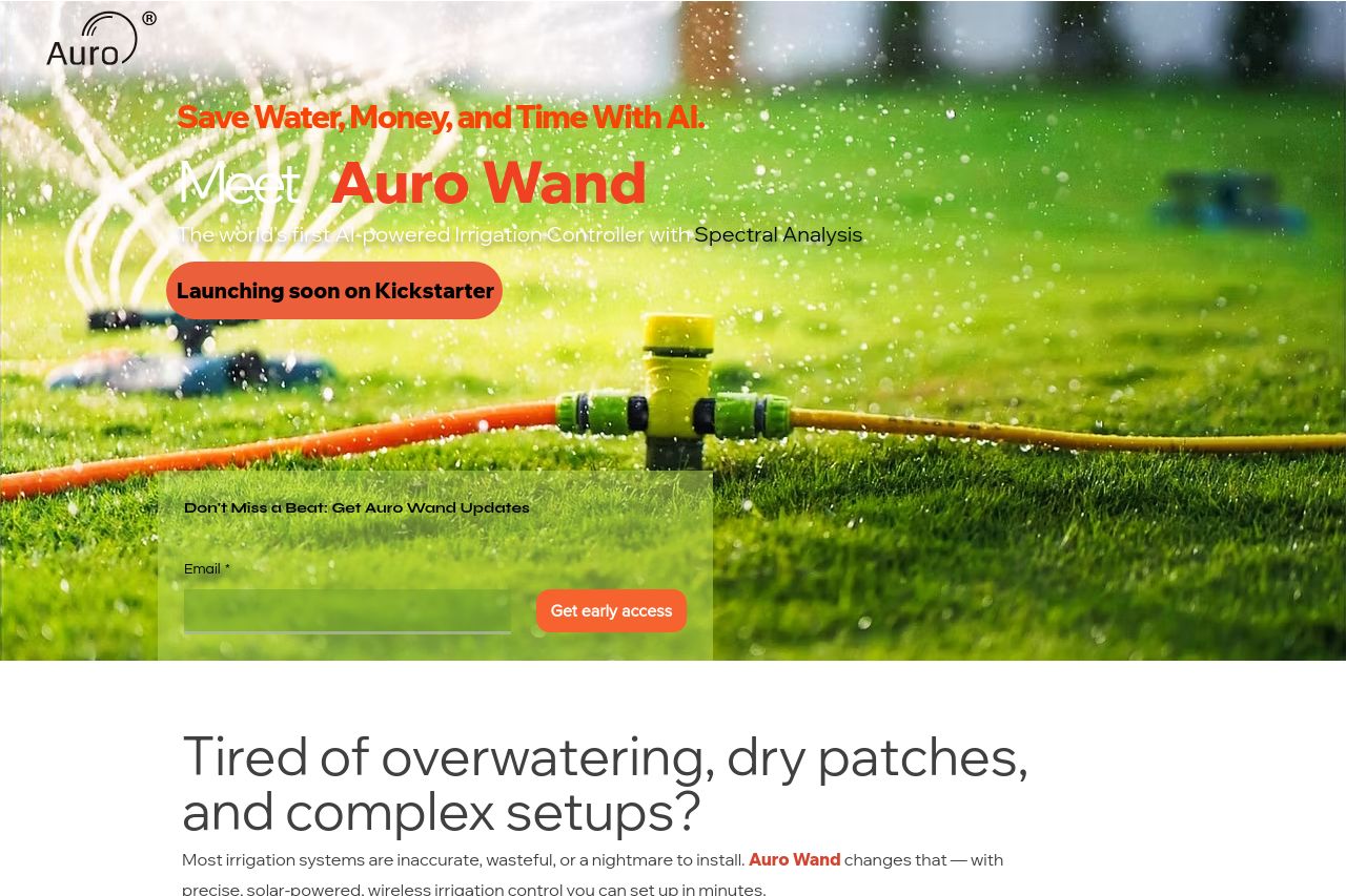
The landing page for the Auro Wand does some things well but could use some serious rethinking in several areas. The main value proposition is somewhat clear, highlighting that the product is an AI-enhanced, solar-powered irrigation controller that promises savings and convenience. However, it stumbles in driving direct action, especially with its crowded and somewhat confusing CTA placement. The page's organization and structure fail to lead the viewer logically from information to conversion.
Visuals are a mixed bag. Highs: Clear images that pitch the product well in its setting. Lows: A chaotic color palette that muddles emphasis. The layout isn't the worst offender, playing with a clean look, but it lacks punch where needed most. Text readability is another missed opportunity—drowning potential hooks in less thought-out typography and layout decisions.
Credibility is shaky. The apparent lack of social proof elements beyond a vague Kickstarter mention doesn't cut it for a product asking you to change potentially expensive habits.
In short, you’re dealing with a mess that needs serious attention if you want this to convert. Fix your structure, get serious about your CTAs, and calm that color riot you're calling a design.
- Clarify the main CTA and make it prominent.
- Streamline the design with better color choices to create clear visual hierarchy.
- Add social proof such as testimonials or reviews for increased credibility.