co.uk
Landing Page Analysis
Save big at your favourite UK stores with Vouchermate! Get the latest verified voucher codes and daily deals.
65
Share on:
Summary:
50
Messaging
60
Readability
60
Structure
50
Actionability
65
Design
90
Credibility
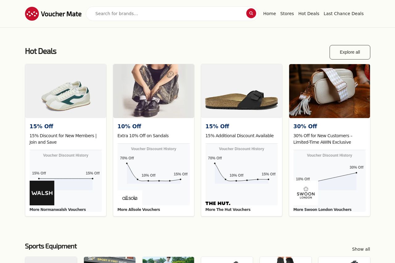
The page feels busy and crowded, giving an overwhelming first impression. There’s a ton of information to sift through, but not much stands out to guide the viewer efficiently. The layout is repetitive, with similar-sized boxes creating a monotonous visual structure that doesn't allow for any standout features. Text and images are crammed, lacking adequate spacing which hampers readability. However, there is consistency in the use of vouchers and deal blocks, and the adherence to a clean color scheme provides some sense of order. Still, a more dynamic layout could improve visual interest and user engagement.
Main Recommendations:
- Reduce the number of similar-sized boxes to create more focus on key deals.
- Increase space around text and images for better readability.
- Experiment with different layouts to break the monotony of repetitive blocks.