howtopoland.com
Landing Page Analysis
Everything you need to know about living in Poland. Visa requirements, bank accounts, taxes, and job hunting tips from people who moved there.

Summary:
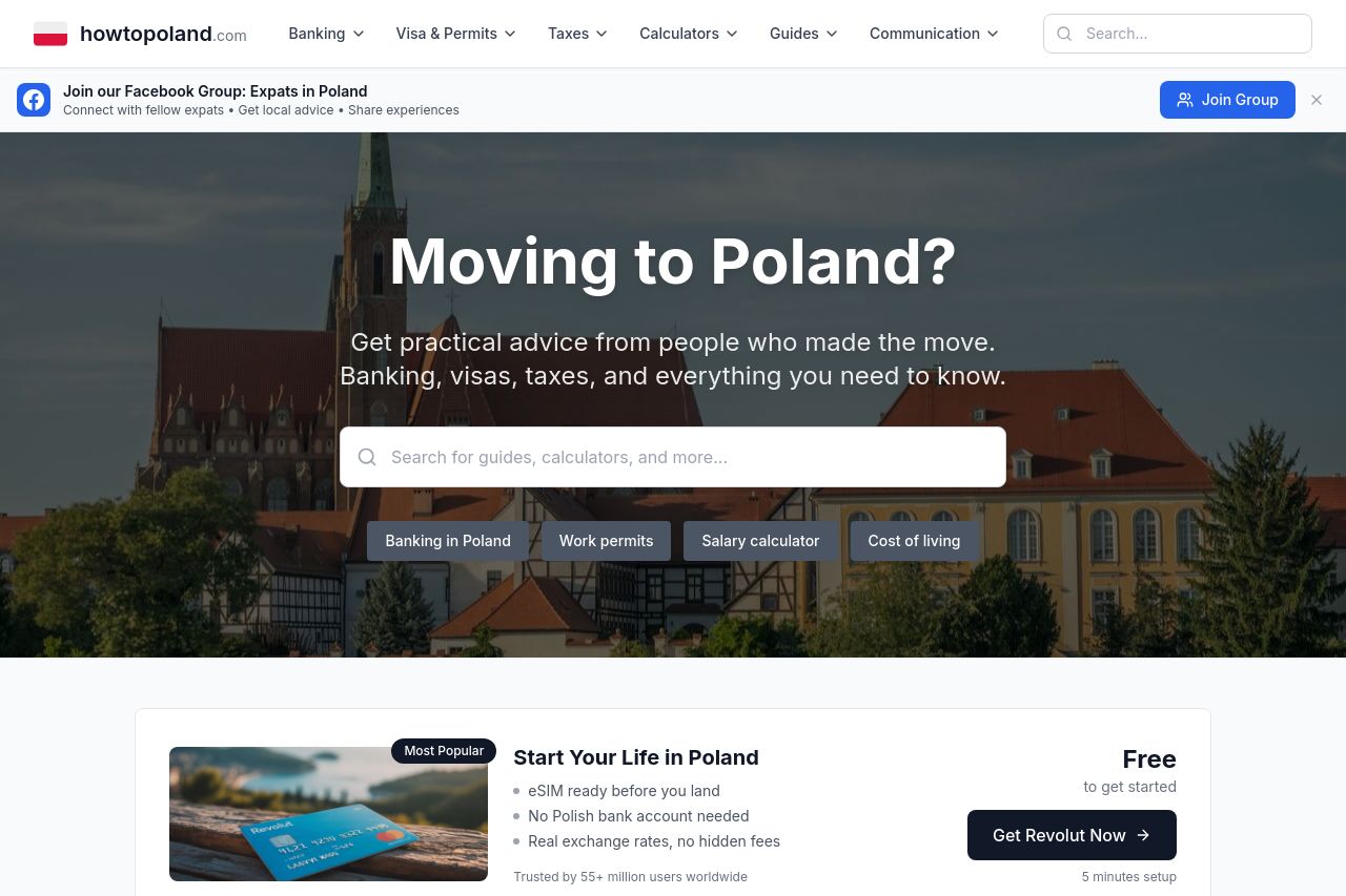
The landing page does a solid job of addressing its target audience by directly asking "Moving to Poland?" and emphasizing practical advice on banking, visas, taxes, etc. However, the page feels quite generic, lacking personality or unique elements that could make it stand out. The value proposition is somewhat clear, but could be better supported with vivid examples or testimonials from people who actually moved. The readability is decent with a simple layout, but everything feels a bit too structured and dull, making the user journey a tad monotonous. The design is clean and professional, yet uninspired; the use of whitespace is commendable but could use a splash of creativity. Credibility is fairly strong with the inclusion of a Facebook group, but there's room for improvement by showcasing more testimonials or partner logos. Finally, the CTAs are present but don't pop out enough to drive action effectively.
- Use more engaging visuals or testimonials from expats to add personality and trust.
- Enhance CTAs with better contrast or unique design elements to draw attention.
- Incorporate more dynamic elements or sections to break the monotony of the layout.