clientport.app
Landing Page Analysis
Share projects, files, and updates with clients in one branded space. No more scattered emails or lost files. Start free with 2 clients & 3 projects.

Summary:
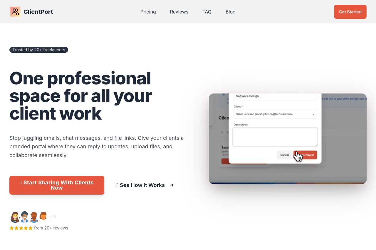
ClientPort presents itself as a slick landing page that clearly targets freelancers looking to streamline their client communication. The strongest part of the page is its visual appeal; the use of bright contrasting colors with a consistent color scheme grabs attention without being too overbearing. The visuals and layout are professional and intuitive, which is a big plus.
The value proposition is front and center, focusing on benefits relevant to freelancers. Headlines like "One professional space for all your client work" and "Choose the perfect plan for your freelance business" are bold and reassuring.
However, the messaging could be sharper. While it does touch on freelancer-specific needs, it lacks a hook that makes it irresistible. The CTAs are mostly clear and action-oriented, yet more variety could enhance actionability. Some sections feel text-heavy, and the repetition could tire the user's patience. There's a good mix of client testimonials, but some sections feel overcrowded without adding much new information.
Overall, ClientPort stands strong in design and credibility but could benefit from refining messaging and structure for even greater impact.
- Sharpen the value proposition in the main headline to make it more unique and appealing to freelancers.
- Add more specific use cases or success stories to deepen audience alignment.
- Consider reducing text in repetitive sections to maintain user engagement without overwhelming them.