velionna.com
Landing Page Analysis
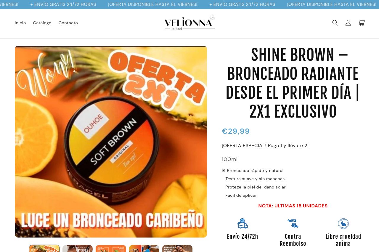
🌴 ¡El Bronceado Soñado Está a Solo un Paso! 🧡 2x1 — Llévate 2, Paga Solo 1 Este verano no te escondas. Luce la piel dorada, radiante y caribeña que siempre has querido. Shine Brown no es una crema c
Summary:
The landing page for Shine Brown offers some strengths but has a lot of room for improvement. The messaging is clear, emphasizing the product's effectiveness and a sweet deal with its 2x1 offer. The tone is lively and matches the tropical theme. However, the visual clutter is overwhelming, with repetitive imagery and excessive bright colors that can detract rather than attract. Readability suffers due to font choices, colors, and a lack of hierarchy. Too many distractions and a chaotic layout make navigating the page a chore. Social proof is abundant, but cluttered and could be presented more concisely. Placing too much emphasis on similar images of the product doesn’t help to convince skeptical buyers who need more than flashy graphics. CTAs are heavily packed into each section, sometimes overshadowing the main message. Overall, the busy design and inconsistent layout dilute potential effectiveness.
- Simplify the overall design to reduce visual clutter, focusing on clearer information hierarchy.
- Enhance readability with better font and color choices to improve visual clarity and reader engagement.
- Streamline CTA placement to make it more prominent without overwhelming the user.