rightlensai.com
Landing Page Analysis
A tool that connects everyday work into one space. It gives you and your teams AI tools—search, writing, note-taking—inside an all-in-one, flexible workspace.
Summary:
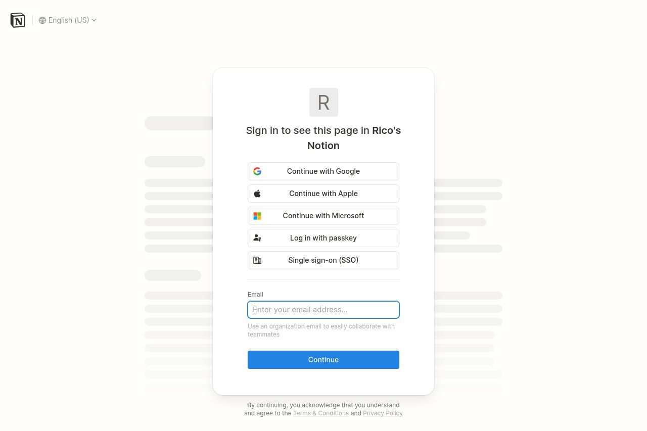
The login page for this Notion workspace is minimalistic but effective for its purpose. The text is clear and straightforward, providing multiple login options that cater to the most commonly used platforms like Google, Apple, and Microsoft. This gives the user flexibility and ease of access. The CTA button "Continue" stands out due to its blue color against a predominantly white background, although it's not a very inviting color scheme—it feels a bit sterile and lacks personality. The simplicity is a plus, but it borders on boring. There's no introduction or value proposition indicating why someone should bother logging in, which might be necessary for first-time users. The page does its job, but does it without flair. Overall, it's functional but lacks any engaging elements.
- Add a brief introduction or tagline above the log-in options to explain the benefit of using this Notion workspace.
- Incorporate a more inviting or warm color to the CTA button to make it visually appealing.
- Consider adding a small graphic or icon related to productivity to inject some personality.