com.br
Landing Page Analysis
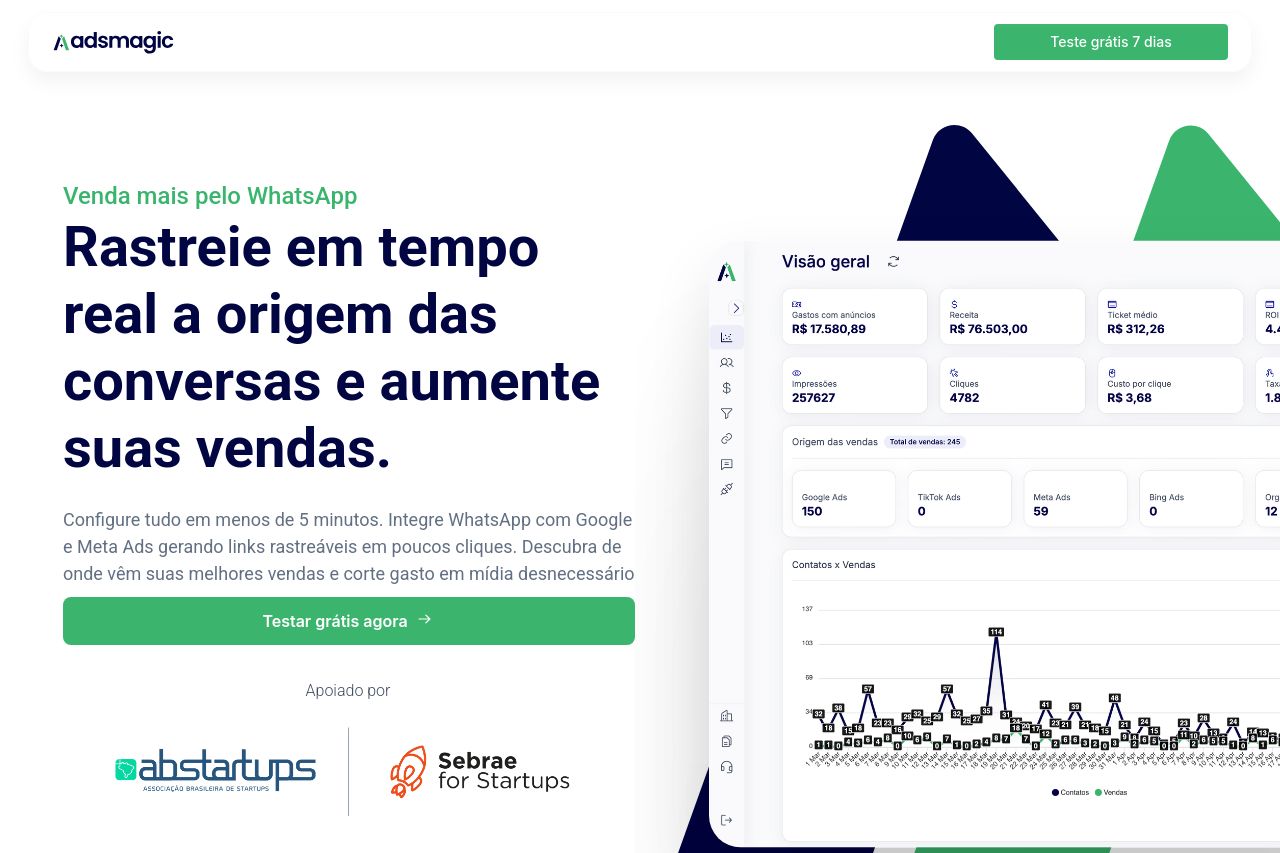
Unifique métricas, rastreie leads e vendas do WhatsApp e otimize campanhas com inteligência. Aumente conversões e reduza custos com o Adsmagic!
Summary:
Overall, the landing page does a decent job of explaining what Adsmagic offers, but it struggles to stand out or feel engaging. The value proposition is present but lacks a punch to immediately grab attention. Visual hierarchy is improved by effective use of contrast in headers, yet the layout feels a bit generic and uninspired. The repetition of CTAs and poor CTA variety limits effectiveness, preventing distinct actions and thus hindering higher conversions. Messaging aligns with the audience but could use more specific examples or testimonials to resonate better. The design, while clean, could benefit from more dynamic elements to make each section more interesting. There are evident social proof elements which help in gaining trust, but they could be highlighted better to stand out. Calls to action are visible but largely similar throughout, adding little to the user journey and sense of urgency.
- Diversify the CTAs to prevent message fatigue and boost engagement.
- Enhance visual elements to break monotony and make each section feel distinct and engaging.
- Use more specific testimonials or case studies to strengthen credibility and audience alignment.