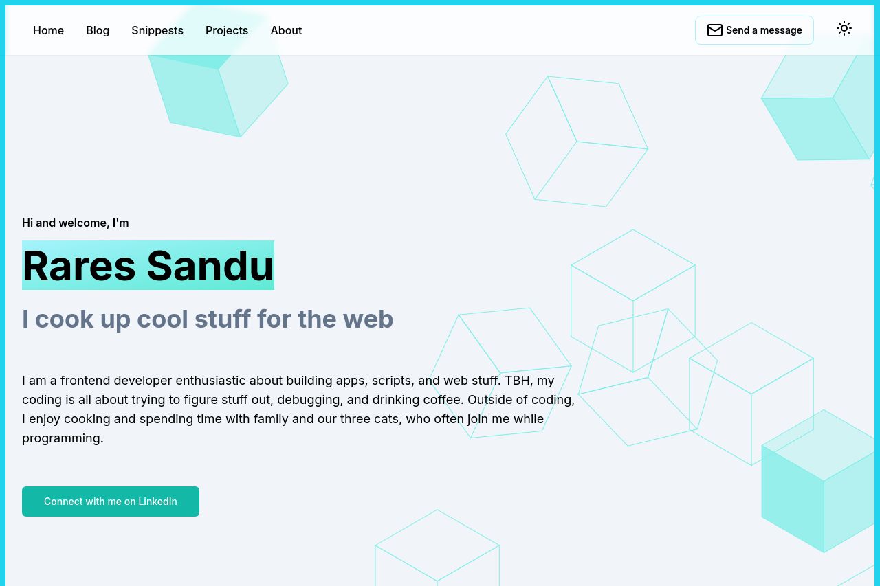
rares-sandu.com
Landing Page Analysis
Explore Rares Sandu's portfolio showcasing frontend development expertise in React, Next.js, and TailwindCSS. Check out projects and learn about my passion for building modern web applications.

Summary:
The landing page provides a personal touch with a casual tone, introducing Rares Sandu as a friendly, approachable person. However, the main value proposition feels quite vague, and there's a lack of clear examples of what specific 'cool stuff' he cooks up. The design is clean, but the overuse of teal and white makes it bland. The CTA feels a bit lost as it doesn't stand out enough, blending into the background too much. Consistency is well-maintained across the sections, but the information hierarchy could use some work. Credibility is lacking due to the absence of testimonials or client logos. Overall, it's a decent start, but it could be more engaging and informative.
- Clarify the main value proposition by stating specific services or skills.
- Enhance the CTA by making it more prominent and action-oriented.
- Include testimonials or client logos to boost credibility.