performancein.live
Landing Page Analysis
This website stores cookies on your computer. These cookies are used to improve your website experience and provide more personalised services to you, both on this website and through other media. Yo
Summary:
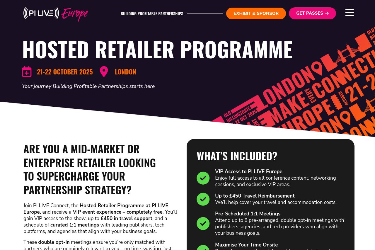
The landing page for the Hosted Retailer Programme does a decent job of highlighting key information. The visuals are bold and attention-grabbing, with a consistent color scheme that aligns well with the target audience of brand marketing managers. However, some issues severely undercut its effectiveness. The value proposition could use more clarity; while it's somewhat clear, the details get a bit lost in extensive blocks of text. Additionally, the call-to-actions blend too much with surrounding elements and lack urgency, which may hinder conversions. While the page features strong social proof through logos and sponsorships, the overall design suffers from lack of visual hierarchy and cluttered sections. The navigation, though functional, is somewhat hindered by headings that don't sufficiently guide the user through the content in a logical manner. Ultimately, the page feels somewhat dated and could benefit from a more modern look and improved readability to keep users engaged and informed.
- Simplify and clarify the value proposition by reducing text density and emphasizing key benefits.
- Strengthen call-to-action buttons to stand out more and use action-oriented language for better results.
- Improve information hierarchy to better guide users from main points to supporting details.