creatorfest.com
Landing Page Analysis
This website stores cookies on your computer. These cookies are used to improve your website experience and provide more personalised services to you, both on this website and through other media. Yo
Summary:
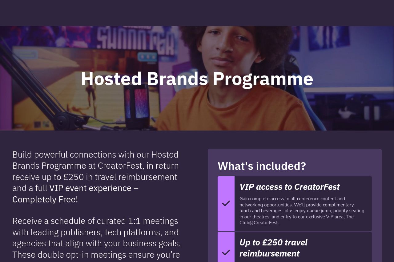
The landing page has a strong start with a clear emphasis on connecting brands through an exclusive event, which is appealing to brand marketing managers. The use of terms like "VIP event experience" suggests exclusivity and value, which works in its favor. However, the page misses the mark on coherence and flow. The copy is verbose and struggles with repetition, diminishing its impact—expressions like "completely free!" are used unnecessarily emphatic marketing gimmicks. Visually cohesive but plagued by pop-ups (the cookie notice becomes overbearing, disrupting user experience). The design is clean, with a good use of color contrast; however, the CTA buttons need more consistent placement and visibility. Overall, the page portrays a professional impression but lacks punchy, persuasive communication.
- Simplify the text to make it more impactful and straightforward.
- Enhance CTA visibility and placement to guide users smoothly through the page.
- Reduce the dominance of the cookie notice or make it less intrusive.