pipeorganmap.com
Landing Page Analysis
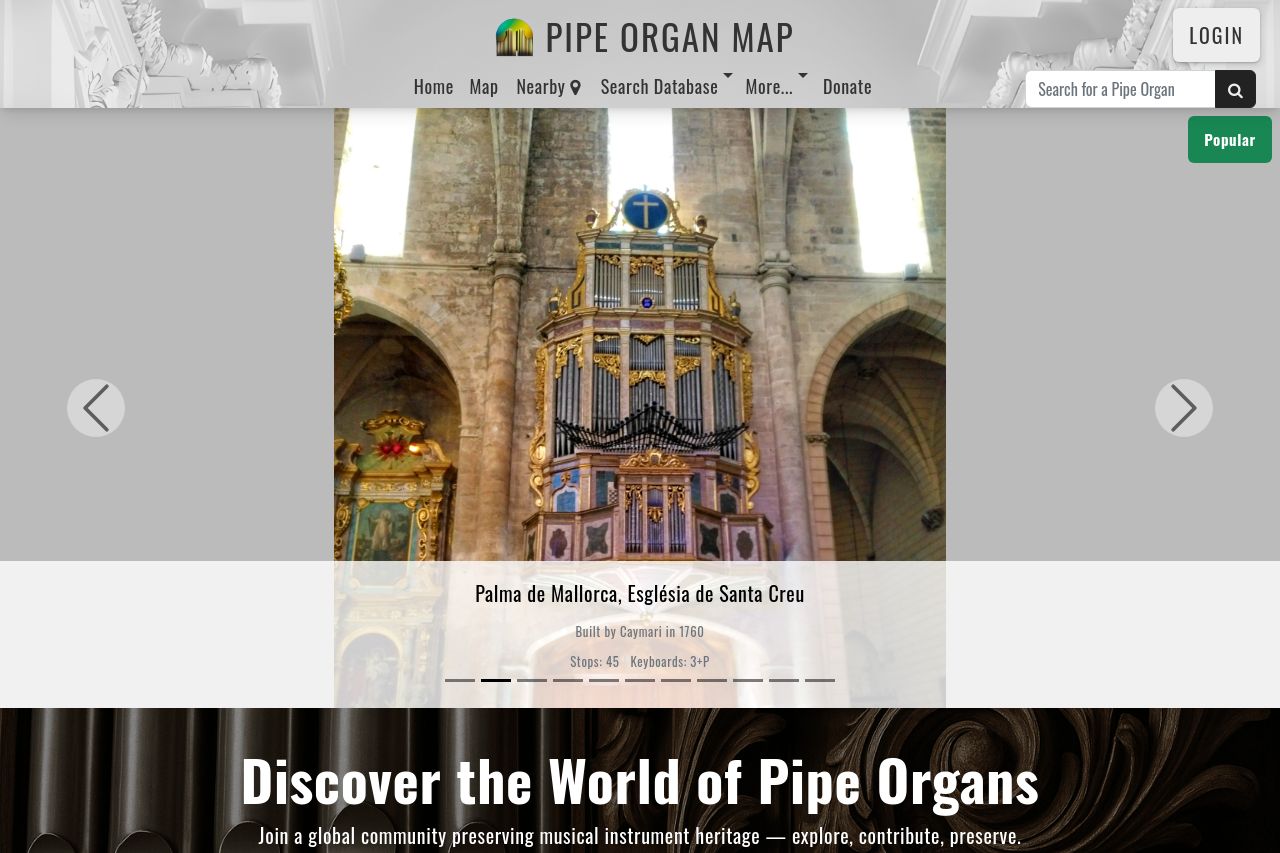
Explore and contribute to Pipe Organ Map — the free international database with interactive map, stoplists, photos, and builder info.
Summary:
The landing page for Pipe Organ Map is well-targeted towards pipe organ enthusiasts, offering a clear value proposition with strong community-driven elements. The use of high-quality imagery helps convey the essence of pipe organs effectively. The messaging is clear and benefits are clearly outlined, although it could be more targeted with stronger CTAs. The layout is somewhat cluttered due to the cookie consent banner being overly prominent, diminishing user experience. There’s a good use of testimonials giving credibility, but the overall design lacks the sophistication needed to draw immediate interest.
The color palette is pleasant and coherent, but there's room for improvement to differentiate important elements better. The page doesn't deliver its navigation well due to large text blocks that make scanning difficult. Overall, the imagery does a good job supporting the theme but more interactive elements or demos would enhance engagement.
- Improve the visual hierarchy by using different font sizes or weights.
- Enhance the CTAs to be more action-oriented and specific.
- Simplify the navigation to make information easier to access.