somenu.digital
Landing Page Analysis
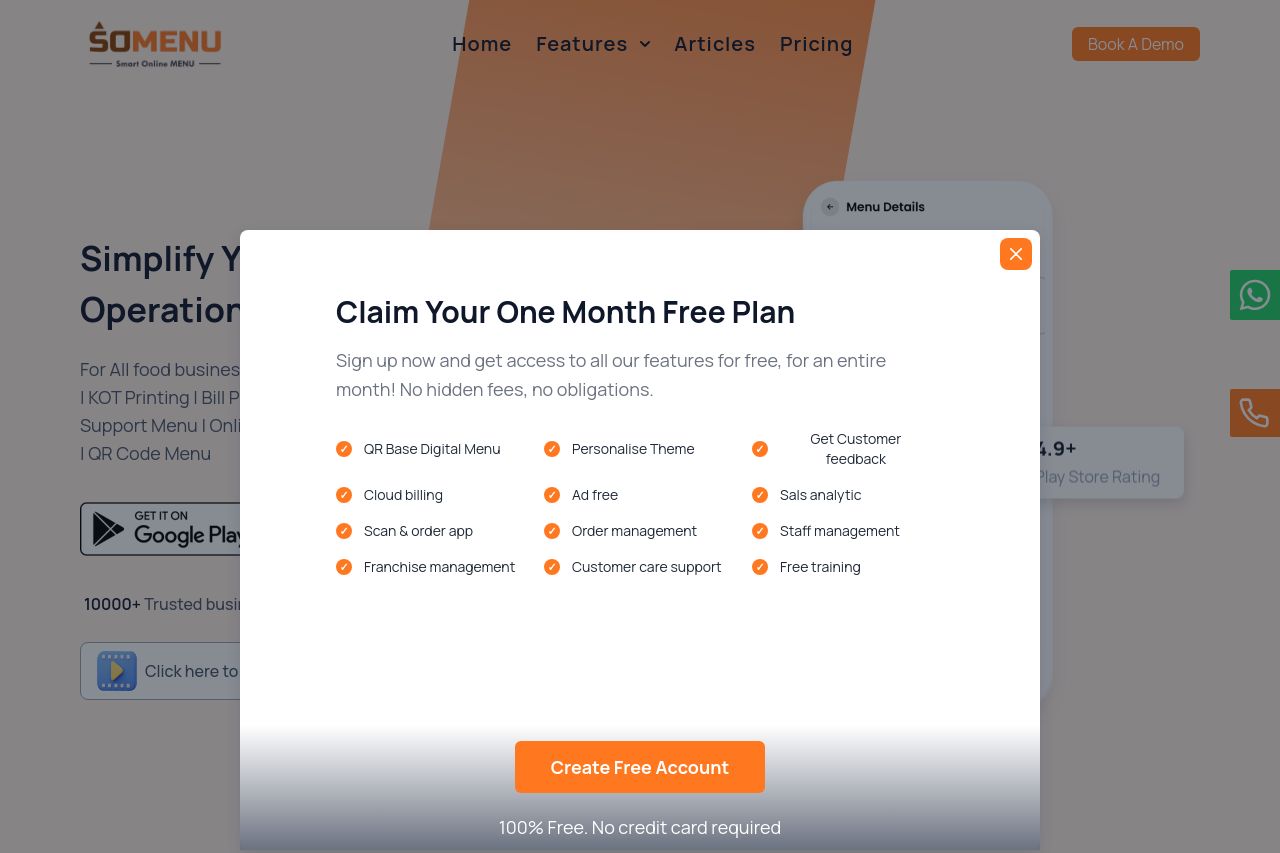
Summary:
Overall, the page is a mix of solid elements and some glaring issues that need addressing.
The messaging is good as it effectively communicates the key benefits of the service, but it doesn't stand out as much as it could. Detailed features are mentioned which helps, but the tone could be sharper and more aligned with tech-savvy users.
Readability suffers due to dense text and lack of visual breaks. The sections blend together, making it hard to digest information quickly. Whitespace usage is average but not outstanding.
Design wise, there's some consistency, but the use of space could be better. The colors are mostly professional, but certain elements lack distinction, especially the CTAs.
The structure could use a rethink. Some sections flow well, while others seem disjointed, lacking a logical progression. Important information is scattered, and headings don't stand out enough to guide navigation. Finally, actionability is average, with the main offer repeated but CTAs not being standout enough to grab attention consistently.
Credibility is somewhat lacking as there’s minimal use of social proof or trust badges, which could significantly boost user confidence.
- Enhance CTA visibility with stronger contrasting colors and more prominent placement.
- Improve readability by breaking up text into more digestible chunks and using bullet points.
- Add trust elements like testimonials or recognizable client logos to boost credibility.