vibecodingretreat.com
Landing Page Analysis
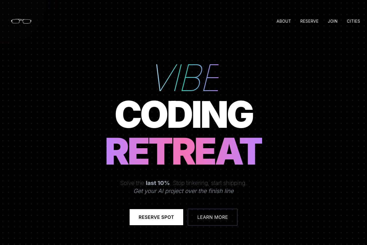
Urban coding retreat in Detroit. Get hands-on support to complete the final 10% of your vibe coding projects. Limited spots available.
Summary:
The Vibe Coding Retreat landing page is visually impressive with a bold, modern aesthetic. The color scheme effectively captures the attention of coders and entrepreneurs seeking a vibrant and energetic learning experience. The "stop tinkering, start shipping" tagline is powerful, but the value proposition could be clearer—what precisely sets this retreat apart isn't immediately obvious. The imagery and use of animated backgrounds reinforce a tech-savvy image but can feel overwhelming or distracting. Readability suffers due to flashy typography that sometimes prioritizes style over clarity. The detailed offerings such as mentorship and networking are buried deeper in the content than they should be. With a focused restructuring, the message could be more impactful.
- Clarify the unique selling points of the retreat directly on the hero section.
- Enhance text readability by adjusting typography and reducing distractions.
- Reorganize information hierarchy to highlight key benefits and features early on.