zscrap.ai
Landing Page Analysis
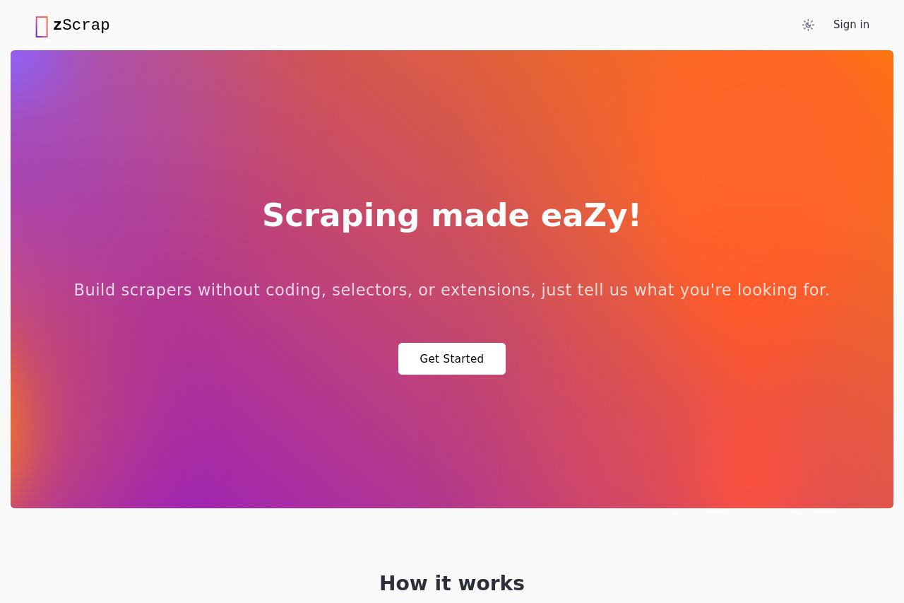
zScrap
Summary:
The zScrap landing page has a good start with its bold value proposition. "Scraping made eaZy!" is catchy and to the point, which sets the right tone and clearly states the main service.
However, the gradient background, while eye-catching, might not resonate with a professional audience interested in scraping solutions. The call-to-action is clear, but it doesn't stand out enough against the vibrant background. The 'How it works' section is straightforward, aiding in understanding, but could benefit from more detailed examples or visuals to enhance comprehension.
Overall, the page isn’t overwhelming, but lacks depth in engaging graphics and detailed explanations that could provide more assurance to potential users about the service's value and ease of use.
- Enhance the call-to-action button to make it more visually distinct.
- Use a more professional color palette to attract a broader audience.
- Add detailed examples or user testimonials to the 'How it works' section to increase credibility.