pvkalkulator.pl
Landing Page Analysis
Sprawdź opłacalność fotowoltaiki w systemie net-billing, oblicz zwrot z inwestycji i porównaj oferty instalacji paneli słonecznych na pvkalkulator.pl
Summary:
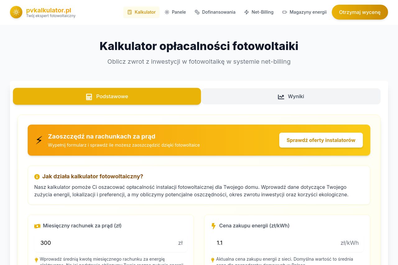
The landing page for the PV calculator offers clear information about calculating the feasibility of solar panel installations. The value proposition is clearly articulated, with the primary goal focused on savings and efficiency in the net-billing system. The color scheme is consistent and appealing, predominantly using yellows and whites which align well with the energy theme. The structure is logical and provides a natural flow, breaking down information into digestible sections. However, some parts suffer from excessive text, which could overwhelm users.
The design feels slightly dated, with some elements like buttons blending too much into the background. Though there are calls-to-action, they lack immediacy or a sense of urgency to compel users to act now. Also, while the site explains its purpose well, it's somewhat verbose, detracting from quick readability and skimmability. The Open Graph setup is functional, but not eye-catching enough to tempt impulse clicking.
- Simplify key sections to promote faster understanding.
- Enhance CTA design to make them more action-oriented and prominent.
- Reduce redundant text to ensure clarity and conciseness.