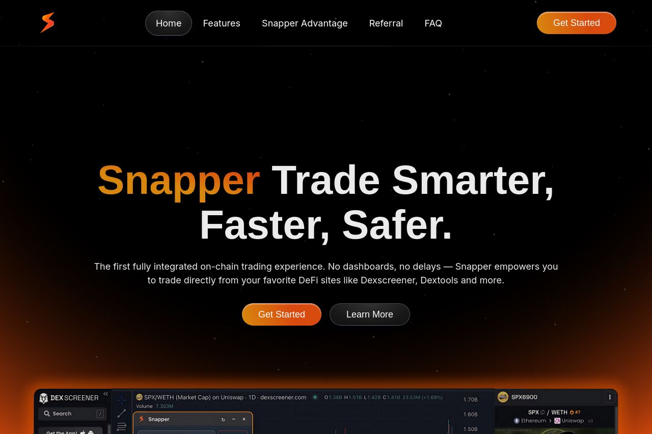
snapper.trade
Landing Page Analysis
Trade Smarter, Faster, Safer. The first fully integrated on-chain trading experience.
73

Share on:
Summary:
70
Messaging
60
Readability
65
Structure
50
Actionability
80
Design
90
Credibility
The Snapper landing page delivers a visually appealing but function-rich offering, aimed at DeFi traders. Right off, the clear value proposition stands out: smarter, faster, safer trading. The use of bold typography and the black and orange color scheme enhance branding and provide strong contrast throughout the page. However, sections feel verbose; key points get lost among dense paragraphs, causing fatigue. There's a lack of interactive elements or engaging demos to showcase real-time usage. Calls to action are scattered, differing in purpose and location, leading to potential confusion.
Main Recommendations:
- Simplify the text by breaking it down into more digestible parts.
- Create a unified and standout call-to-action button across sections.
- Incorporate more interactive elements or demo videos that highlight Snapper's functionality.