moodiday.com
Landing Page Analysis
Compare reviews and ratings for the best cannabis brands near you. Share your honest reviews so no one has to have another disappointing experience.
Summary:
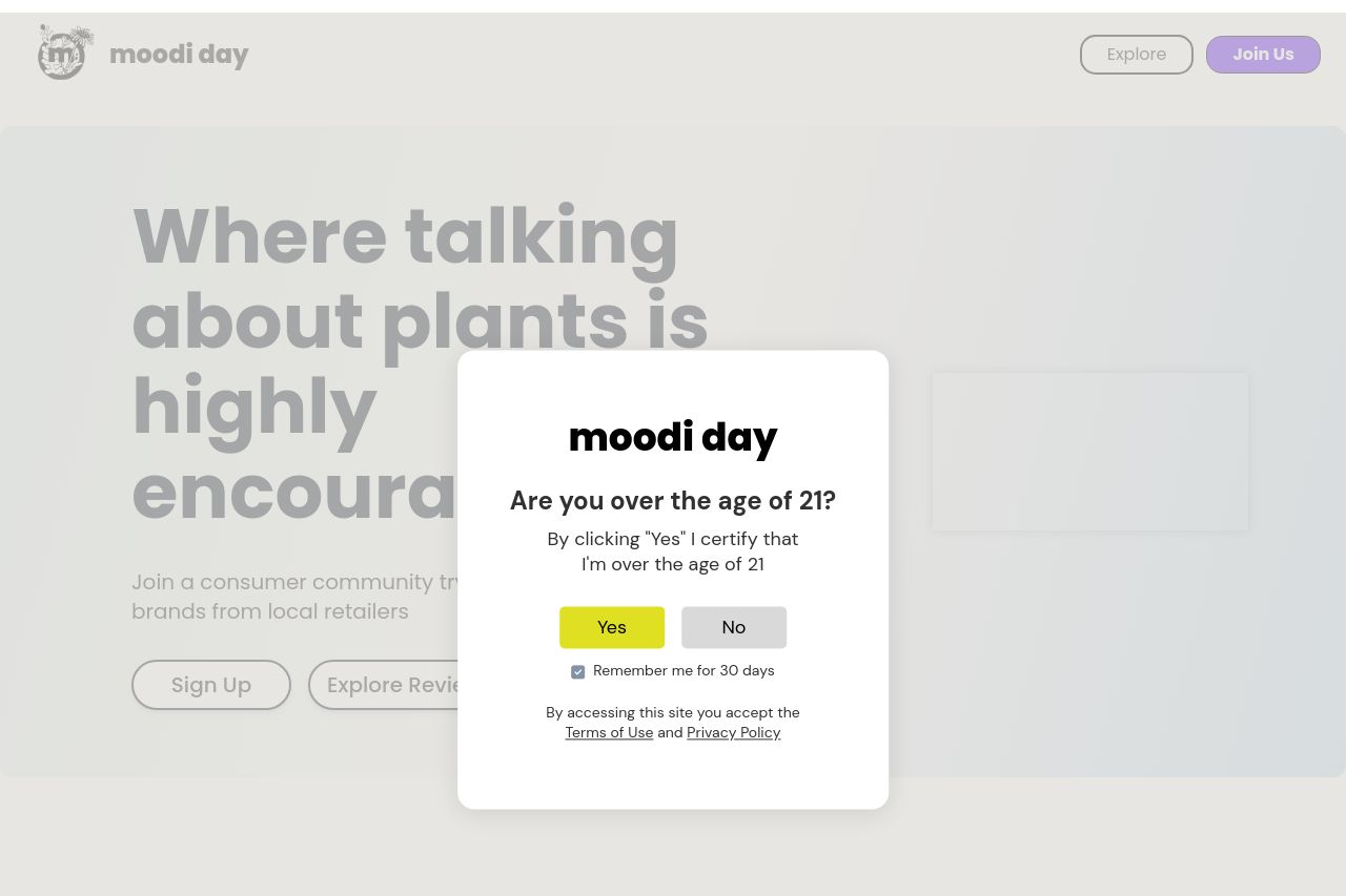
The landing page is visually clean but lacks a strong sense of urgency or emotional connection with the audience. The color scheme is consistent, but the design feels somewhat uninspired and fails to capture the spirit of cannabis culture, which could appeal more to an engaged audience. Certain critical information about the product's benefits or why users should engage is easy to overlook because the most impactful elements aren't given proper visual emphasis. The call-to-action placements could be more pronounced; currently, they tend to blend in rather than stand out. Social proof elements need more prominence to build trust and credibility effectively. Overall, the messaging could use more clarity and punch to truly appeal and convert the target audience.
- Revamp the hero section with a stronger, more emotional headline that immediately conveys the benefits.
- Reorganize the information hierarchy to highlight user benefits and social proof more prominently.
- Enhance the call-to-action buttons, making them more visually distinct to increase conversions.