auroinnovation.com
Landing Page Analysis
Home
Summary:
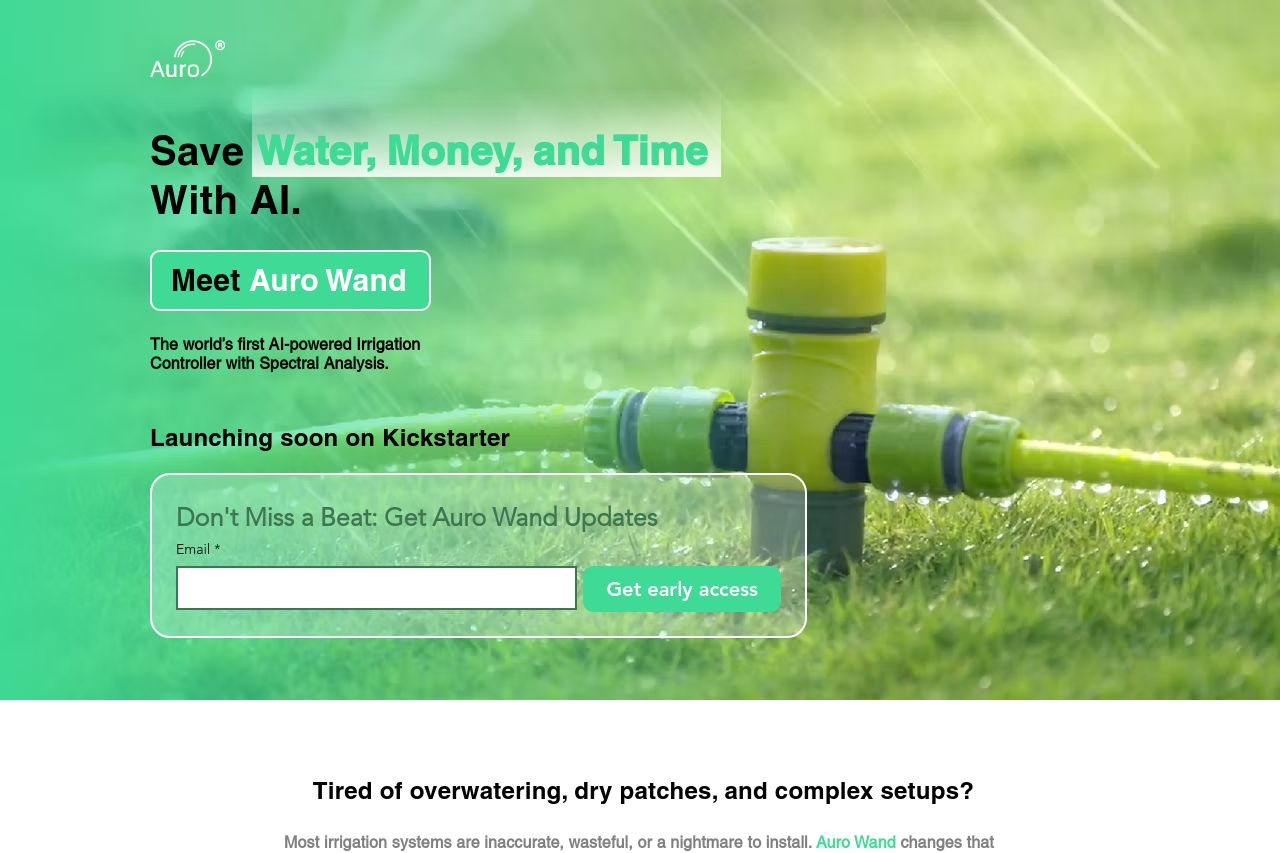
The Auro Wand page has a clear value proposition, emphasizing water, money, and time savings with AI-powered automation. The hero section is visually engaging with a bold call to action, but the text's reliance on jargon like "spectral analysis" could be alienating to laypeople. The tone of voice is assertive yet approachable, aligning well with the audience's need for efficiency in gardening. While the readability is generally strong, some sections contain dense information that could benefit from simplification and breaking down into digestible parts.
The design uses a consistent green theme that reinforces the eco-friendly aspect of the product, although the repetition of green might blend important elements like CTAs into the background. Information is organized in a logical flow, but navigation could be improved with more distinct headings. Credibility is moderately strong, with technical jargon underscoring professionalism but lacking enough personal or customer-focused social proof like testimonials or endorsements.
Overall, the page communicates its message effectively but could bolster actionability by making CTAs more prominent and distinct. Social proof elements like testimonials, customer stories, or recognizable logos would also enhance trust and convert more visitors.
- Simplify explanations to reduce jargon and make the benefits more accessible, like explaining 'spectral analysis' simply.
- Make CTAs like 'Get early access' more visually distinctive with contrasting colors.
- Add testimonials or user stories to build credibility and trust.
- Increase the visual distinction between headings for easier navigation.