whatthefood.io
Landing Page Analysis
Get accurate nutritional analysis and recipe preparation instructions from any food image in seconds with our free AI food detection app; What The Food.
Summary:
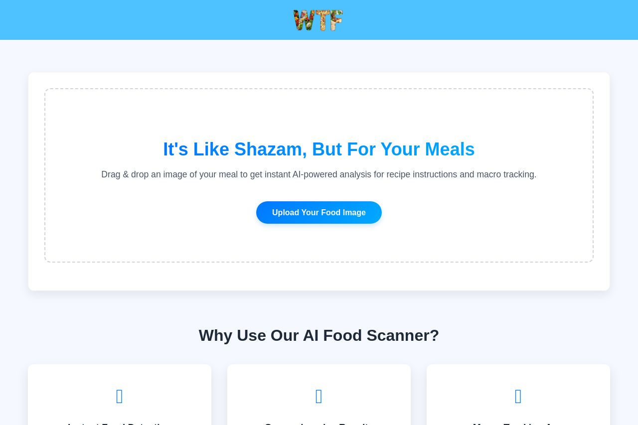
The landing page does a solid job of communicating its core value proposition by comparing its product to Shazam, which is clever. However, the rest of the messaging doesn’t explore this compelling concept enough and quickly delves into features without fully establishing the benefits.
The design is neat but lacks a strong visual hierarchy, with everything appearing somewhat flat and generic. The uniform color scheme, while sleek, could benefit from more contrast to make important information stand out more.
Readability is high, thanks to clear typography and short paragraphs, but the page suffers from a lack of engaging visuals that support the written content. While the CTAs are somewhat noticeable, they lack urgency and specificity, causing them to blend too much into the overall design.
Credibility is supported by a few trust elements, but the credibility could be bolstered with more testimonials and recognizable logos. The organization of information is decent, but some essential details could be emphasized more to improve the navigation and flow.
- Increase visual hierarchy with varied font sizes and weights.
- Boost credibility with testimonials or recognizable client logos.
- Enhance CTA urgency by improving placement and copy.
- Introduce more engaging imagery to support the text.