esidehustles.com
Landing Page Analysis
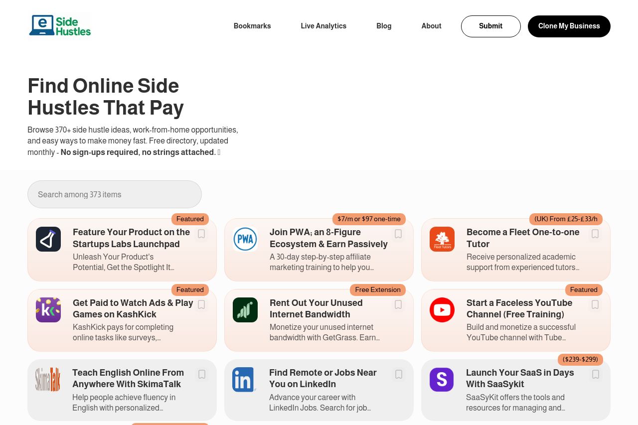
Browse 370+ side hustle ideas, work-from-home opportunities, and easy ways to make money fast. Free directory, updated monthly - No sign-ups required, no strings attached. ✨
Summary:
The website does a good job of presenting a broad selection of side hustles, neatly categorized and presented right at the top. This grabs attention quickly. However, the design feels a bit flat due to limited color variations and lack of visual hierarchy. The layout becomes repetitive, making the engagement level drop as users scroll. The "Featured On" section potentially adds credibility, yet its placement feels awkward. While the founder's section tries to add a personal touch, it's hidden towards the latter part and may not immediately build trust. CTAs are sparse, lacking urgency or strong verbs. Overall, a little too safe and missing a punch to really grab side hustlers' attention.
- Use more visual differentiation between categories to add interest.
- Clearer, more action-oriented CTAs with specific verbs could improve engagement.
- Improve visual hierarchy with varied font sizes and colors for better flow.