kanan.co
Landing Page Analysis
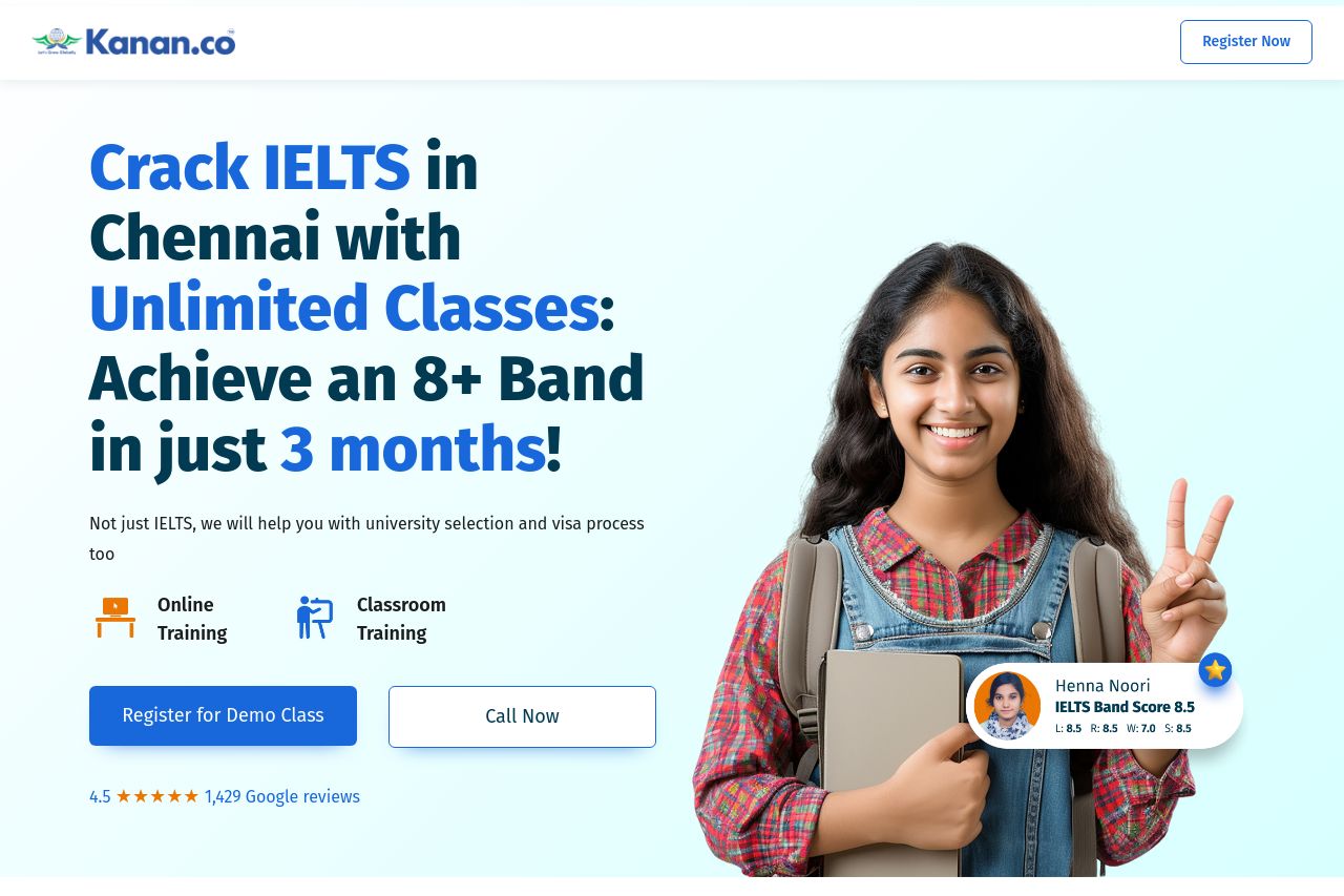
Not just IELTS, we will help you with university selection and visa process too

Summary:
Overall, the landing page is solid but not without its flaws. The value proposition is crystal clear right from the start, promising a high IELTS score swiftly. The use of bold, energetic headlines captures attention but might come off as overly salesy to a discerning audience. The page's design is clean and consistent, with a logical flow of information that takes the user from initial interest to the specifics of what is offered. Trust elements are plentiful, with testimonials and the stats enhancing credibility. However, the call-to-action is a bit too repetitive, making it lose its uniqueness and impact. The readability is hampered by text-heavy sections, especially the bios, which could be tightened. There's a professional tone, but injecting more personality might increase engagement.
- Simplify and tighten up text-heavy sections, particularly trainer bios, for better readability.
- Introduce some visual breaks or icons in densely packed sections to maintain engagement.
- Vary the call-to-action phrases to keep them distinct and more impactful.