howtopoland.com
Landing Page Analysis
Everything you need to know about living in Poland. Visa requirements, bank accounts, taxes, and job hunting tips from people who moved there.
Summary:
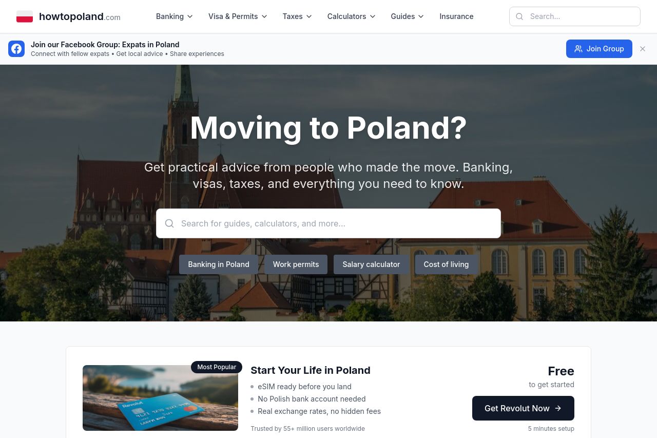
This landing page is doing a decent job for those considering moving to Poland. The headline "Moving to Poland?" directly addresses the target audience and immediately establishes relevance. The value proposition around "Banking, visas, taxes, and everything you need to know" is clear, but could still use more focus on specific benefits or guidance unique to this site. The design uses a strong visual hierarchy, contrasting headings with body content, which aids legibility and structure. However, the imagery is pretty generic and does little to enhance the message beyond providing a cultural context.
The navigation structure helps break down information logically, but it gets a bit overwhelming. There are too many categories and sub-categories, risking a loss of focus for users who might not know where to click first. The CTAs are present but not particularly compelling or conspicuous; they blend in more than they should. In terms of credibility, the trust elements like user testimonials or recognition from established entities are glaringly absent, which could be a significant concern for newcomers needing assurance. Overall, while the site does its job, it leaves room for more engaging, targeted, and credible content.
- Simplify navigation to prevent overwhelming users.
- Enhance imagery to support messaging, making it visually engaging.
- Include social proof elements like testimonials or trust badges.