rival-sonar.com
Landing Page Analysis
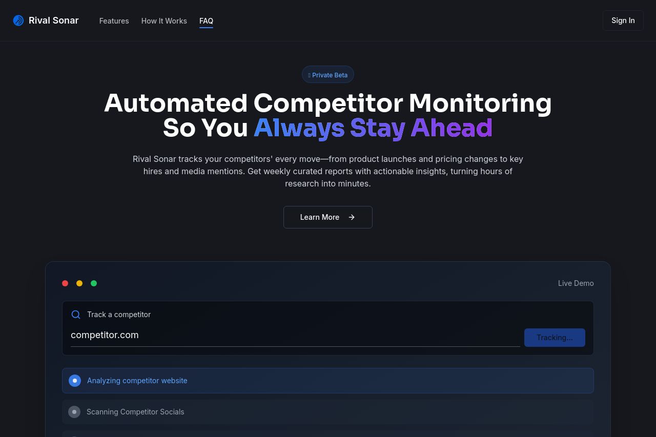
Minimal and Intuitive Competitor Tracking tool
Summary:
Rival Sonar's landing page is clean and minimalistic, which aligns well with its description as a competitor tracking tool. However, while it does a good job in clarity, it lacks a bit in differentiation and engagement.
The hero section starts strong with a focused and clear message about automated competitor monitoring. The use of color in the phrase "always stay ahead" could engage visitors, but its impact diminishes without supportive visual content or reports showcasing what visitors will gain instantly.
Messaging throughout is straightforward but misses opportunities to directly speak more key benefits and outcomes tailored for B2B SaaS founders. There's not a strong emphasis on the specific pains it solves, more of an assumption that the visitor already knows the value of such a tool.
Visually, the color scheme is professional, yet it borders on overly dark. With subdued tones, the risk is losing the attention of a distracted visitor quickly swapping between tabs. The readability is generally good due to clear typography and short sentences but could benefit from more lively visuals or contrasting sections to break monotony.
The call-to-action is simple but lacks urgency and prominence. CTAs feel passive, and the the "Learn More" button doesn't drive action strongly enough amid a subdued palette. Adding urgency to the private beta message could also potentially increase conversions.
The site attempts to show credibility with a hint at AI insights but lacks specific trust imagery like testimonials or trust badges, which would make it more believable and appealing. The absence of these elements weakens its competitive stance.
- Enhance visual engagement with lively imagery or contrasting sections.
- Improve CTA urgency with action-oriented language like "Get Started Today".
- Include testimonials or client logos to bolster credibility.