bordersnap.xyz
Landing Page Analysis
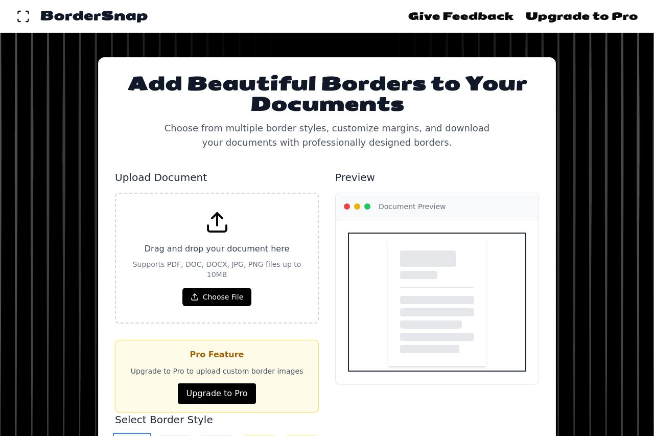
Choose from multiple border styles, customize margins, and download your documents with professionally designed borders.
Summary:
The landing page aims to showcase a tool for adding borders to documents, but it lacks focus and clarity. The hero section relies on overly verbose language rather than demonstrating the product benefits succinctly. The background pattern might be visually interesting, but it distracts from the main content. The arrangement and design of the page elements need improvement to maintain user engagement and guide the user towards the CTA more effectively.
The page's readability suffers due to inconsistent use of spacing and a cluttered layout. The color scheme is overly monochrome, making it challenging for crucial elements to stand out. While there are attempts at providing a clear CTA, it's not prominent enough to drive conversions effectively.
Credibility is minimal with no evidence of user trust elements or established brand presence. This undermines the site's professionalism and trustworthiness, essential for user conversion.
- Improve text clarity and value proposition by simplifying language and removing unnecessary details.
- Enhance CTA visibility by using distinct color contrasts and better placement near the bottom of sections.
- Add social proof elements (testimonials, reviews, etc.) to build credibility and trust.
- Use more whitespace to separate elements and improve layout structure.