digitalscientists.com
Landing Page Analysis
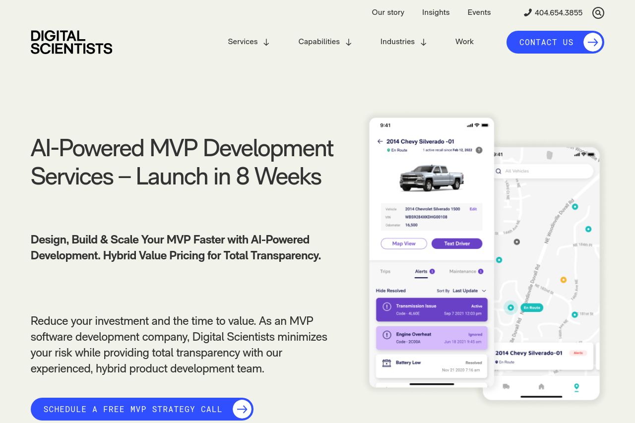
Accelerate learning and validate your concept within 8 weeks with a minimum viable product. Contact us today to kick-start your MVP app development.
Summary:
Overall, the landing page boasts a solid professional appearance but struggles with clarity and engagement. The messaging is somewhat clear about the company's capabilities in MVP development, through the repetition of the core offer such as "AI-powered MVP Development". However, the tone lacks warmth and creativity, making it feel dry and corporate. The readability is somewhat hindered by lengthy paragraphs and unengaging text blocks. Design-wise, the visual hierarchy could be more pronounced to guide the reader's attention more effectively. While consistency is adequate, colors are bland and don't do much to stimulate interest. Structure-wise, the content follows logical flow but lacks engaging hooks. Actionability is marred by bland CTAs that lack punch or urgency. Credibility is well established with social proof elements, but more personal transparency about team members or leadership could boost trust.
- Enhance CTAs with more engaging verbs and specific actions, like 'Start Your MVP Journey'.
- Improve visual hierarchy by using contrasting colors for key sections.
- Break text into shorter, more engaging paragraphs to aid readability.