thechefsidea.com
Landing Page Analysis
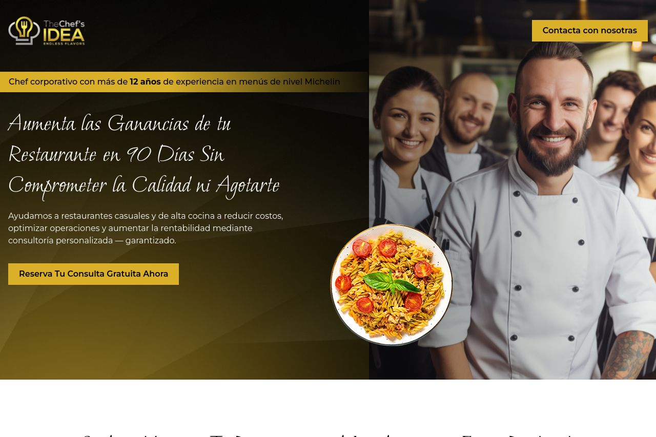
Ayudamos a restaurantes casuales y de alta cocina a reducir costos, optimizar operaciones y aumentar la rentabilidad mediante consultoría personalizada — garantizado.
Summary:
The landing page does a decent job of highlighting the problem and offering a solution tailored to restaurant owners. "Aumenta las Ganancias de tu Restaurante en 90 Días Sin Comprometer la Calidad ni Agotarte" is a focused and compelling headline. However, some sections are cluttered, particularly with excessive text that could intimidate instead of inform. The call-to-action buttons like "Reserva Tu Consulta Gratuita Ahora" are clear but don't always stand out due to a lack of contrast with the background. Images break the monotony of text well but don't always contribute meaningfully to the understanding of the service. Sections feel disconnected, impacting the reading flow and making navigation cumbersome. There are trust elements present but they’re not prominent enough to immediately instill confidence in the audience.
- Increase visual contrast for CTAs to make them stand out.
- Simplify text in sections to improve readability and engagement.
- Ensure sections logically flow into each other for better narrative cohesion.