trenovaapp.com
Landing Page Analysis
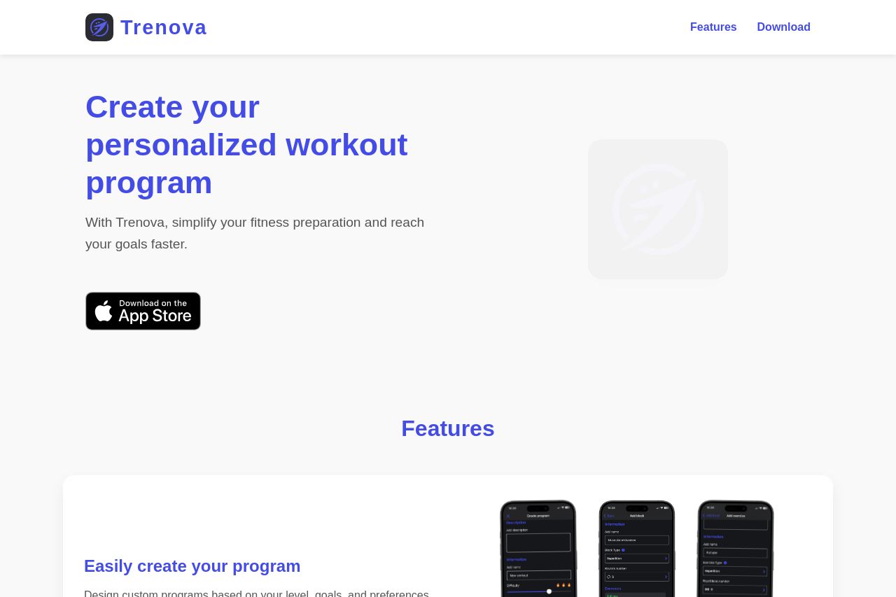
With Trenova, simplify your fitness preparation and reach your goals faster.
58

Share on:
Summary:
50
Messaging
55
Readability
70
Structure
50
Actionability
40
Design
70
Credibility
The landing page for Trenova is clean but lacks impact. The messaging is clear about personalizing workout programs, but it's generic and lacks depth. Visually, the page is quite plain, relying on consistent colors but failing to utilize engaging imagery or distinctive typography. Readability is hindered by lack of visual excitement in the text presentation. Structurally, the page follows a basic flow, but there's a missed opportunity to build excitement or urgency around the call-to-action (CTA).
Main Recommendations:
- Add engaging visuals or graphics to break up the monotony.
- Enhance the value proposition with more specific benefits or unique features.
- Improve CTA visibility and urgency to drive more conversions.