jobbotic.space
Landing Page Analysis
Struggling to get interviews? Jobbotic helps you fix your resume and beat Applicant Tracking Systems. Analyze your resume instantly with AI.
Summary:
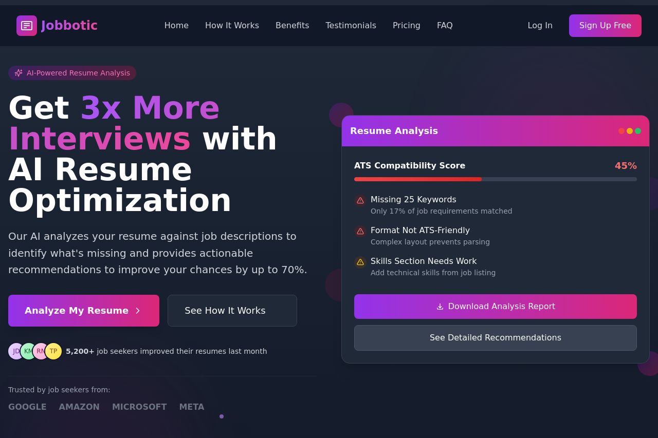
Page Overview: The landing page for Jobbotic is visually appealing with its sleek, modern design. The use of vibrant purples and pinks grabs attention, and the layout is pretty organized. However, there's a sense of repetitive content which dulls the impact.
Messaging: The headline "Get 3x More Interviews with AI Resume Optimization" effectively conveys the value proposition in a direct manner. Benefits are clearly communicated, like the boost in interview chances, but it lacks detailed examples that would make this more convincing.
Design: There’s an engaging visual hierarchy. Important elements are highlighted, but the excessive use of similar shades from the same color family adds monotony. The CTAs are vibrant but blend into the colorful design, making them less distinctive.
Readability: Though the text is concise, some areas muddy the message by trying too hard with buzzwords like "AI-Powered." More plain language would enhance accessibility.
Structure: The sequential steps are clear, yet, some sections seem hard to differentiate from others because of similar designs and layouts. Also, user testimonials appear to be crammed in without breathing room to take center stage.
Actionability: The CTAs are present but lack urgency. A few more placements aligning with where the user might be ready to commit could spike conversions.
Credibility: Social proof exists, like logos from trusted companies and user testimonials. However, adding more use cases or detailed stories would enhance believability even further.
Overall, Jobbotic presents a convincing but overcrowded attempt to draw users in by leveraging design and urgency, which sometimes feels more bark than bite. Consider reworking copy, CTA emphasis, and section distinguishing elements to boost overall effectiveness.
- Incorporate more examples or use cases to strengthen messaging.
- Use different colors or additional spacing to make CTAs stand out more.
- Simplify language to improve text clarity and accessibility.