odysea.engineer
Landing Page Analysis
Structural engineering consultant for offshore wind market
Summary:
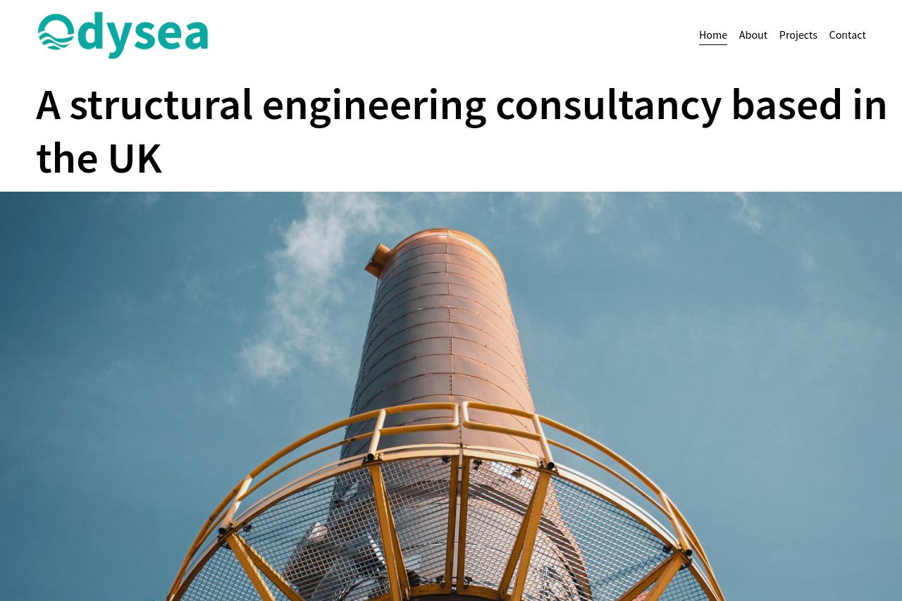
The page has a clean and professional look, which aligns with the brand as a structural engineering consultancy. The hero section is straightforward, with an effective headline that clearly states the business's purpose. However, it lacks a strong call to action, making it feel static. The use of photography is a positive point, adding credibility and a visual element appropriate for the industry. The cookie consent notification is obtrusive and disrupts the visual balance.
In the 'Our Sectors' section, the content explains what the business does, but the text is dry and lacks engagement. Visual repetition with the header image and project images is confusing rather than engaging. The 'Let's Work Together' section could use a more dynamic invitation to action. Overall, the page communicates professionalism, but there's much room for improvement in engagement and motivation of potential clients.
- Add a clear call-to-action in the hero section to engage users immediately.
- Enhance the 'Our Sectors' section with more detailed descriptions and case studies.
- Improve visual hierarchy to guide users more effectively through the page.