miracle.casino
Landing Page Analysis
Your favorite crypto casino
Summary:
The Miracle Casino landing page has a visually appealing design and a catchy use of color. Yet, it lacks clarity in some areas that may impact user experience negatively.
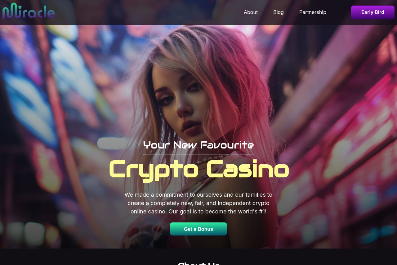
The Hero Section sets an ambitious tone with a prominent image and bold claim, "Your New Favourite Crypto Casino," but fails to clearly define its audience or unique value proposition. The call to action, "Get a Bonus," stands out adequately against the background.
The About Us section employs energetic copy, yet feels generic. Phrases like "passionate creators at heart" are vague, and the copy misses an opportunity to specify why users should choose them over competitors.
The Games Section is visually pleasing with engaging graphics of different games, yet it lacks descriptions or any interactive elements to entice user interaction.
The Partners Section stands out with recognizable logos, contributing to the site's credibility, but the call to action "Become a Partner" could confuse users seeking to play games, not partner with the site.
The Blog Section exhibits a consistent design, but the images might lean too much into stereotypes, potentially alienating parts of the audience.
Overall, the website design is cohesive and attractive, but could use stronger, more targeted messaging and better structuring to guide users smoothly through content sections. A little refinement could go a long way in enhancing conversion rates and engagement.**
- Clarify the unique value proposition and tailor it more to target audience.
- Improve the clarity and positioning of CTAs to enhance user journey.
- Add descriptive content or interactive elements to the Games Section to increase engagement.