jecheolbabsang.com
Landing Page Analysis
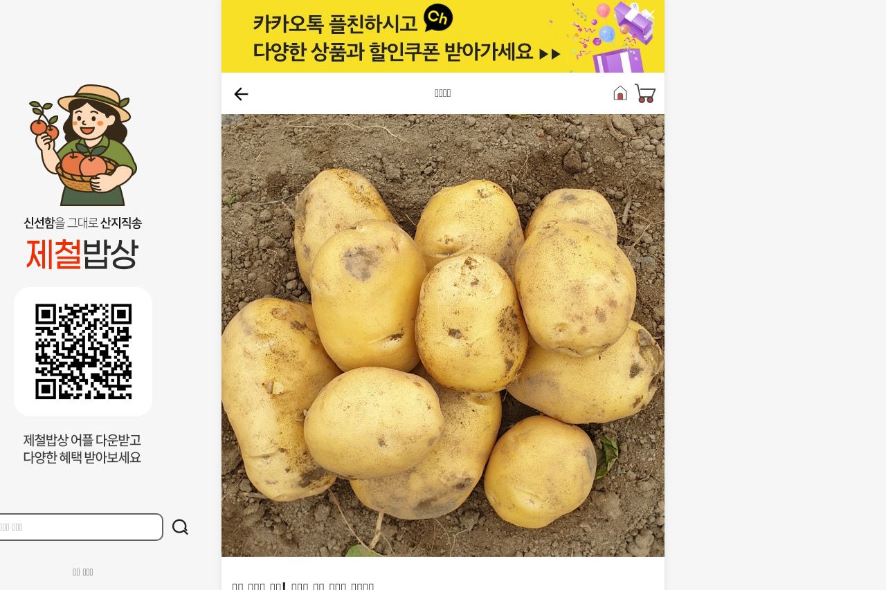
산지직송 건강한 먹거리 "제철밥상" 맛있는 제철먹거리를 만나보세요!
Summary:
The landing page for Jecheol Babsang's "조풍감자" is a mixed bag. On the one hand, the clean and professional design immediately asserts credibility and trustworthiness. The layout is consistent with a coherent style that aligns well with a professional standard. However, where the design shines, the messaging falls flat. The value proposition is muddled and doesn't clearly communicate what differentiates this product from others, beyond just being "강원도 감자". The benefits and features are not robustly communicated, and the audience isn’t explicitly identified, which is a wasted opportunity. Readability is affected by dense blocks of text without breaks and a lack of typographic hierarchy to guide the eye effectively. The absence of powerful CTAs further diminishes user engagement. Without an eye-catching directive, potential customers might leave the page uncertain about next steps. On credibility, the website shines with strong visual professionalism and social proof, but it can enhance transparency by clearly identifying founders or key company figures.
- Clarify the main value proposition and differentiate the product from competitors, e.g., special qualities of 강원도 감자.
- Introduce clear and strong CTAs that guide users to the next step, using concise and engaging language.
- Break up text blocks to enhance readability and introduce more typographic hierarchy to draw attention to key points.
- Provide more information on who the product is for with compelling examples or use-cases.