myown-page.com
Landing Page Analysis
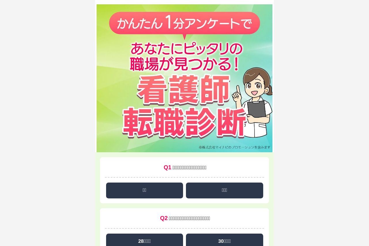
あなたにオススメの職場は…
Summary:
The landing page does some things right, particularly in catering to its target audience of nurses seeking job changes. The messaging is clear with a strong call-out to nurses, using simple steps that might feel approachable and stress-free. However, it falls short in several areas. The design is cluttered with inconsistent use of fonts, colors, and spacing, distracting from the main message. The illustrations used look quite amateurish and might not resonate well with a professional audience. The CTAs blend into the design rather than standing out, potentially reducing conversions. Moreover, some crucial information is buried, requiring unnecessary scrolling, which could be frustrating for those in a hurry. The visuals, including text-heavy sections, could overwhelm instead of inform, and the page lacks a cohesive feel, with abrupt transitions between sections.
- Revamp the design for a more professional look, focusing on consistent colors and typography.
- Enhance the CTAs to make them more prominent and action-oriented.
- Redesign the information layout to ensure critical details are noticeable without excessive scrolling.