hashtensor.com
Landing Page Analysis
HashTensor turns crypto hashrate into Bittensor rewards while decentralizing mining and powering Alpha's deflation.
Summary:
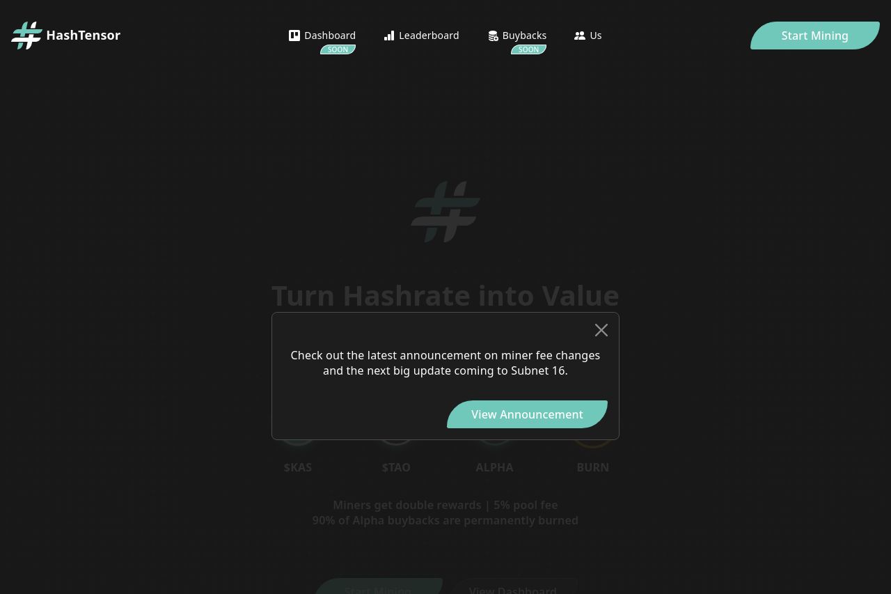
The landing page for HashTensor is a mixed bag. On the positive side, it has a sleek, dark theme that might appeal to the crypto community and miners. The main call to action, "Start Mining," is direct, which is great for users who know what they want. The repeated pop-up about announcements indicates some level of maintenance and update, but its placement is obstructing too much of the content across various sections, which is quite annoying. On the downside, the value proposition is somewhat buried under a dark background with insufficient contrast and does not stand out or communicate effectively what unique benefits HashTensor provides to its users. There's an over-reliance on generic terms like "Turn Hashrate into Value" without providing a real hook or differentiating factor. The navigation bar with options like "Dashboard" and "Buybacks" is unhelpfully labeled as "SOON,” making the site feel unfinished and unprofessional. Overall, it feels like there is an incomplete execution on presenting complex information in a digestible manner, which could alienate both novice and seasoned miners.
- Improve contrast between text and background to enhance readability.
- Clarify the website's value proposition with specific benefits and unique offerings.
- Remove or redesign the repetitive pop-up to ensure it doesn't obstruct content.
- Make sections like "Dashboard" and "Buybacks" functional or provide a clearer ETA if they are truly 'coming soon'.
- Rework the navigation bar to be more intuitive and user-friendly.