wakethetiger.com
Landing Page Analysis
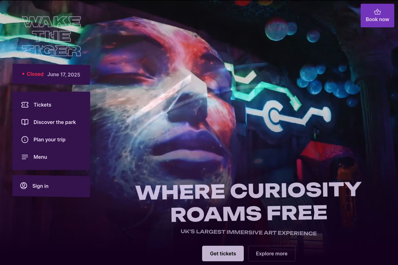
Explore Wake The Tiger, the UK’s largest immersive art experience and the world’s first Amazement® Park in Bristol. Dive into an interactive, mind-bending world.
Summary:
Wake The Tiger's landing page certainly packs a visual punch but falls short in clarity and focus. The main value proposition, "WHERE CURIOSITY ROAMS FREE," is eye-catching but not informative enough about what exactly is on offer. The images are vibrant and engaging, but without clear guidance or context, they lose their impact. The persistent cookie consent banner is a glaring distraction that obstructs the experience repeatedly. Also, closing notifications cast doubt rather than excitement. The design consistency is well done, but the balance between imagery and necessary information is skewed, leaving visitors potentially confused or frustrated.
- Rework the hero section to clearly define what Wake The Tiger offers.
- Improve call-to-action visibility and relevance; make them distinct and inviting.
- Reduce the frequency and prominence of the cookie consent banner.