organ-ize.de
Landing Page Analysis
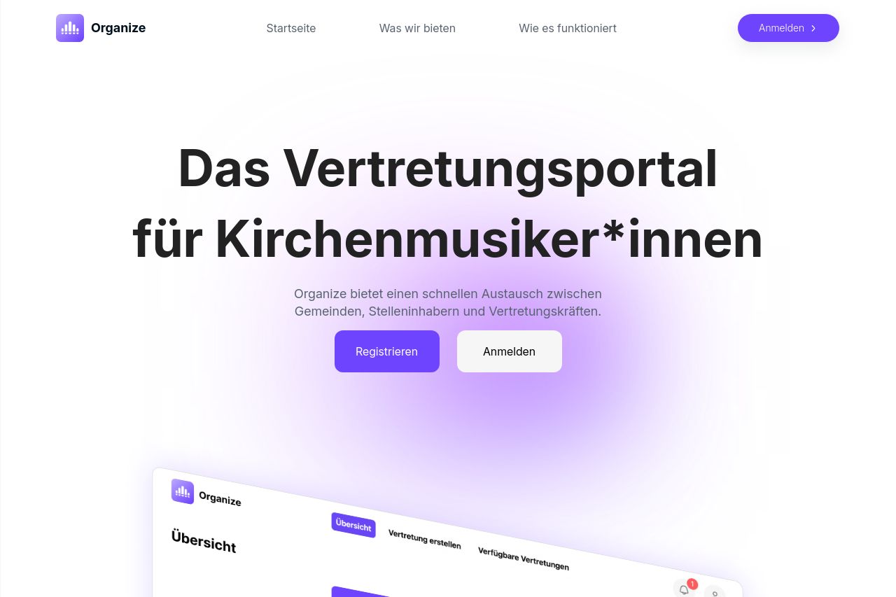
Organize ist die einzige Vertretungsplatform für Musiker. Lassen Sie sich jetzt vertreten oder vertreten Sie jemanden
Summary:
A well-structured landing page with clear purpose but lacking flair. The overall design is clean and modern, using a purple and white color scheme that is visually pleasing. The call-to-action buttons like "Registrieren" and "Jetzt registrieren" are prominent, driving focus on sign-ups. However, the messaging could use more clarity in defining the unique value proposition. The features and benefits are explained, but the language is a bit generic and might not fully resonate with the target audience. The readability is decent, though some text blocks could be broken into smaller, more digestible pieces. The process explanation is straightforward, yet it could benefit from more engaging visuals or demos to break the monotony of text. There's a notable lack of social proof, such as testimonials or trust badges, making the credibility a bit shaky.
- Enhance the messaging to make the value proposition more distinct and compelling.
- Break text into shorter, more digestible paragraphs to improve readability.
- Incorporate social proof like testimonials or user reviews for credibility.