creatorfest.com
Landing Page Analysis
This website stores cookies on your computer. These cookies are used to improve your website experience and provide more personalised services to you, both on this website and through other media. Yo

Summary:
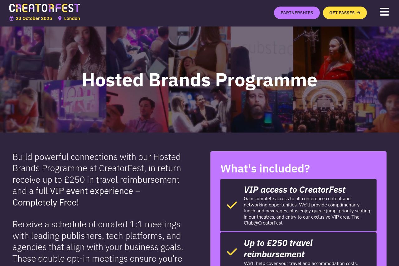
The landing page is vibrant but somewhat overwhelming. The overall design is colorful, targeting a lively audience, which aligns with the CreatorFest theme. However, the excessive use of bold colors can make it hard to focus on key information. The messaging does a decent job at conveying the value proposition, but could be sharper and more targeted. Certain sections of text are lengthy and might lose the reader's interest quickly. While there's some structure, it feels a bit repetitive, especially around explaining the same benefits multiple times. The CTAs are present but can be more standout and compelling. There is trust built in with social proof, but it could be emphasized further with more testimonials or case studies.
- Simplify the text by shortening sentences and breaking up long paragraphs to enhance readability.
- Improve CTA buttons with more action-oriented text and make them stand out more visually.
- Reduce the repetitive information across sections to streamline the reading flow.
- Use a more cohesive color scheme to improve focus and visual engagement.