tapsyrys.online
Landing Page Analysis
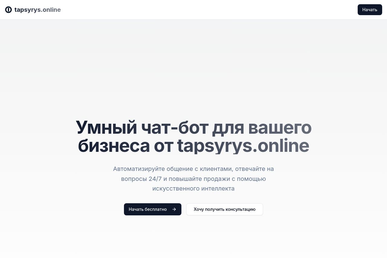
Настройки умного помощника для общения с вашими клиентами
Summary:
The page feels simplistic and somewhat effective in delivering its core message, but it's not without flaws. The main value proposition is straightforward with the mention of automating customer interactions 24/7 using AI, but it lacks the repetition and reinforcement needed for a strong impact. The audience is vaguely hinted at being businesses, but there isn't any explicit mention about their specific needs. Although the tone is consistent and professional, engagement is lacking, leaving rooms where the tone could more closely align with excitement or urgency.
Readability is a mixed bag. The text is simple and free of technical jargon, which is good, but the page suffers from being too plain with insufficient breaks or formatting to create interest. The typography is easy to read, yet the color palette is uninspired, and the layout doesn't do much to hold the reader’s attention past the initial glance.
Design-wise, the page maintains a level of consistency with its elements, but it feels like it’s missing energy. The visual hierarchy is almost non-existent, leading to essential parts being overlooked. The color scheme could benefit from more contrast to bring attention to CTAs or key information.
Structurally, the information is logically presented, albeit too simplistically, which could deter more sophisticated users. The navigation is decent, but a more distinct heading hierarchy should be embraced to guide users more effectively.
Actionability falls flat with generic CTA placements and language that doesn’t compel immediate action. While CTAs are visible, they're lacking the punch needed to drive conversions and could be more strategically placed.
There’s a lack of trust elements which harms credibility; testimonials or recognisable badges could do wonders here. Overall professionalism is average and there are no transparency elements like contact details or social proof to increase trust.
- Clearly define the target audience and address their specific needs.
- Improve CTA action verbs and placement to enhance conversions.
- Add testimonials or social proof to increase credibility.
- Enhance the color scheme for better visual hierarchy and engagement.