evincedev.com
Landing Page Analysis
EvinceDev offers professional eCommerce Development Services in the USA, including responsive web design, payment integration, and custom online store development.
Summary:
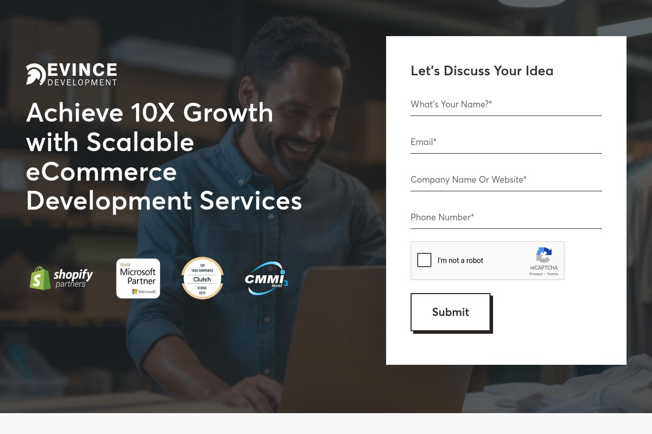
The landing page manages to pack in a lot of assurance with recognized partnerships logos and certifications, which gives off a professional vibe. They also have a clear value proposition of "Achieve 10X Growth", but it feels like typical marketing fluff without enough concrete examples or compelling demos.
The layout is clean, but that doesn't mean it couldn't use an injection of personality. Blocky sections of text, especially in the services listings and platform explanations, seem uninspired, losing chances for engaging storytelling. It’s somewhat like reading a laundry list rather than inspiring confidence in a potential transformational partnership.
Oh, and those CTAs? They are like afterthoughts in terms of prominence. They’re there, but they don’t do enough to boldly say "click me now!" The white space is commendably used, but the unexciting typography doesn’t make the heart race. And let’s not ignore some sections that seem to blend into one monotonous stretch without a clear visual break or funky graphic to punch things up.
Social proof is there with the client logos and testimonials but it’s not particularly engaging or diverse. Testimonials could use fleshing out with story-driven content rather than leaving the visitor to pick meat out of bones. The Open Graph data doesn’t exactly scream "must check this out!" It reads more like a directory listing teaser than a teaser for something worth diving into.
- Enhance the visual excitement with more varied and dynamic images or graphics to break the monotony.
- Emphasize CTAs with bolder design and more frequent strategic placement to guide user action.
- Diversify testimonial content and integrate storytelling to better engage visitors.