startupgarage.uz
Landing Page Analysis
Innovative ideas, successful businesses, essential tools, knowledge, and support for entrepreneurs, the path to success, a startup community, video tutorials and guides, online courses, startup founda
Summary:
The landing page seems to be a mixed bag of both good and bad elements.
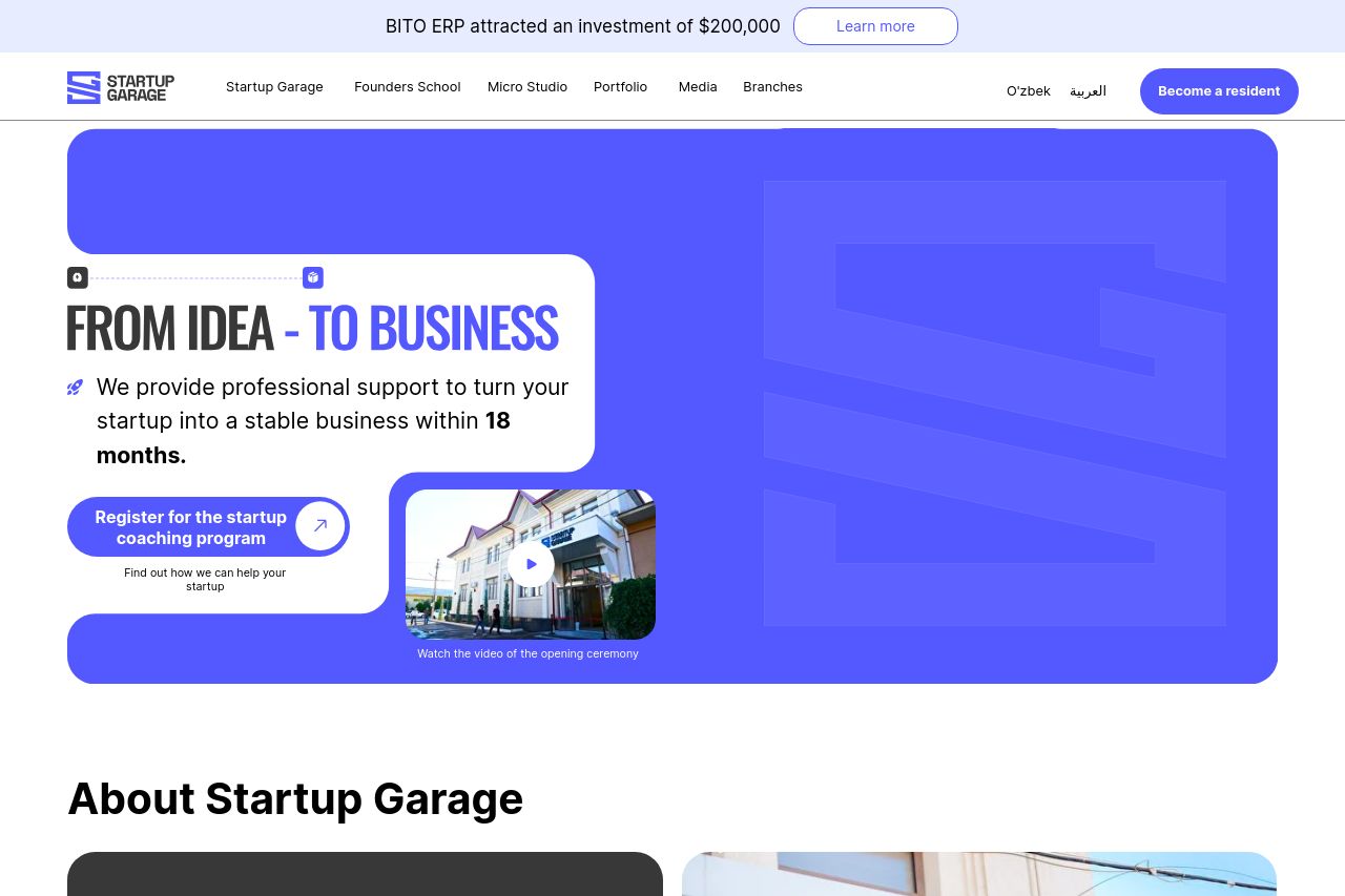
The design is overall appealing, with a consistent color scheme and a professional look; however, the visual hierarchy needs work. Important elements like the CTA could stand out more to grab immediate attention.
The messaging is where things start to unravel. The main value proposition isn't as clear as it should be. While words like "innovation" and "success" are scattered throughout, they don't communicate a clear and compelling value proposition to the startups visiting the site. The content seems too generic and doesn't seem to resonate specifically with startup founders or beginners as intended.
Readability suffers from convoluted sentences, but the typography is basic and easy on the eyes. However, most critical information is buried, making the page harder to digest.
In structure, there's a good chronological flow from basics to more advanced topics, but navigation can be confusing due to weak headings. Credibility is somewhat established with testimonials and recognizable logos, but missing elements like founder identification weakens trust.
Overall, while a lot of basic ground is covered, the page exhibits a lack of punch in terms of focus and clarity, particularly for its target audience—startup founders and beginners.
- Clarify and strengthen the value proposition to clearly state what the StartupGarage offers.
- Improve CTA visibility and make sure it's action-oriented to guide visitors effectively.
- Simplify and de-jargonize the text for better engagement with novice startup founders.