totaltrenz.com
Landing Page Analysis
Get the best shopping experience. Enjoy great deals and a large selection of products. Buy quality. Shop smart.
Summary:
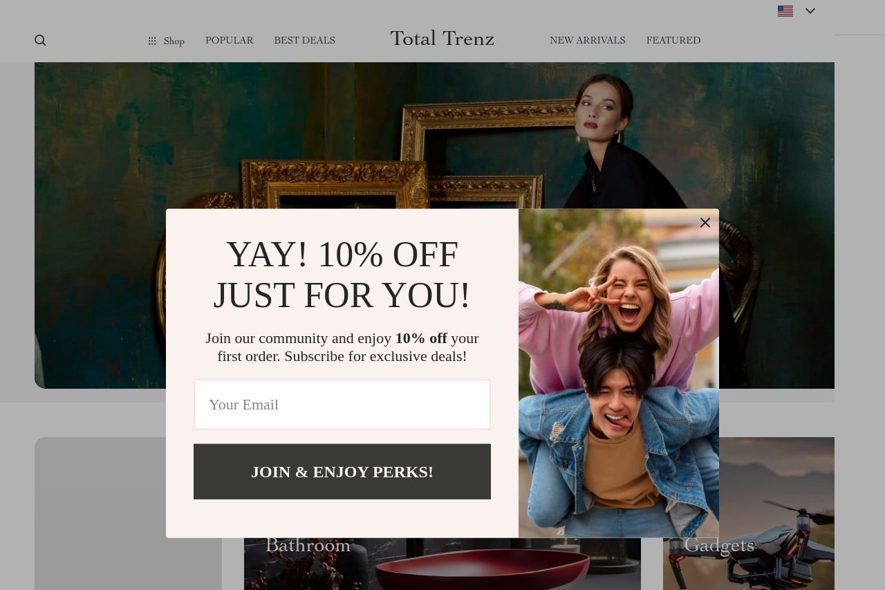
The landing page for Total Trenz feels cluttered and overwhelming, with a massive pop-up taking center stage. The aggressive pop-up offer is distracting, overshadowing the actual product categories displayed in the background. Any potential messaging, like "Sophistication Delivered," gets buried behind the pop-up. The hierarchy feels chaotic, with multiple visual elements fighting for attention. Navigation elements are nearly invisible at the top, easily lost in the color scheme. The text is reasonably easy to read but doesn’t stand out due to the lack of contrast. Credibility could be strengthened with more visible trust elements, though a few testimonials help a bit.
- Reduce the size of the pop-up or implement a delay to allow users to view the actual content first.
- Ensure key messages and CTAs are visible outside of any pop-ups.
- Improve visual hierarchy by using more contrast between navigation and background.
- Integrate more visible social proof and brand logos to establish trust.