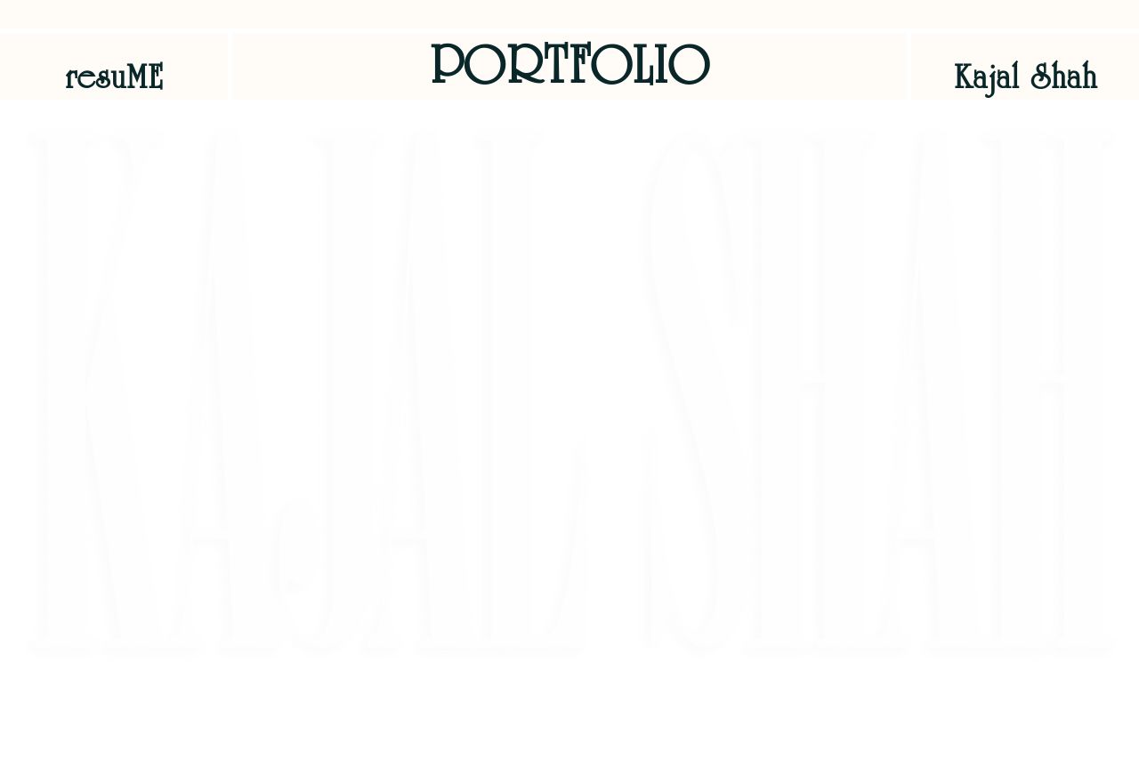
framer.app
Landing Page Analysis
Made with Framer
38

Generated on:
June 16, 2025Score:
38/100Audience:
EmployersShare on:
Summary:
30
Messaging
40
Readability
45
Structure
25
Actionability
35
Design
40
Credibility
The website attempts to showcase a diverse portfolio but falls flat in many areas. The initial impression suffers due to an overwhelming lack of visual clarity and inconsistencies in typography. There’s a notable effort in featuring design projects, yet the overall structure feels chaotic, making navigation a chore rather than a breeze. Information hierarchy seems nearly absent, as essential details aren't given proper prominence. Even though some visual elements are intriguing, they contribute to confusion more than helping to guide users through the page. Overall, the design choices hinder rather than enhance the user experience.
Main Recommendations:
- Revise the visual hierarchy to ensure important information is prominent and easily identifiable.
- Improve navigation with clearer headings and a more intuitive flow.
- Enhance the readability by simplifying text and ensuring consistent typography.