mysamplefiles.com
Landing Page Analysis
Download free high-quality sample files in multiple formats. Perfect for testing, creative projects, and more—accessible anytime!
Summary:
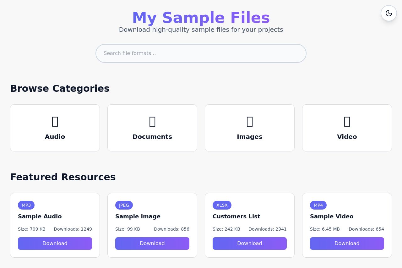
The landing page for "My Sample Files" has some strong points but several weaknesses that need addressing. The messaging is clear in its simplicity with a direct headline like "Download high-quality sample files for your projects." However, it lacks specificity in defining the exact target audience or unique value proposition. The design is clean but borders on too minimalistic, potentially giving an impersonal and bland appearance. The featured resource images are cohesive but low in impact.
Readability is decent, with simple language that's accessible, but some contrast issues between text and background can hinder clarity. The call to action (CTA) buttons are adequately placed and clear, although not very compelling or differentiated.
Credibility suffers as there are no testimonials or recognizable logos to instill trust, making it seem less professional. The structure is fairly logical, but missing critical details like pricing or deeper feature highlights that could guide user decisions.
- Incorporate user testimonials or logos of known brands to build credibility.
- Enhance the design with more impactful visuals or color contrasts to catch attention.
- Define a more specific target audience to tailor the messaging effectively.