games4mobile.site
Landing Page Analysis
★ 4.5
28
Share on:
Summary:
30
Messaging
50
Readability
30
Structure
10
Actionability
35
Design
0
Credibility
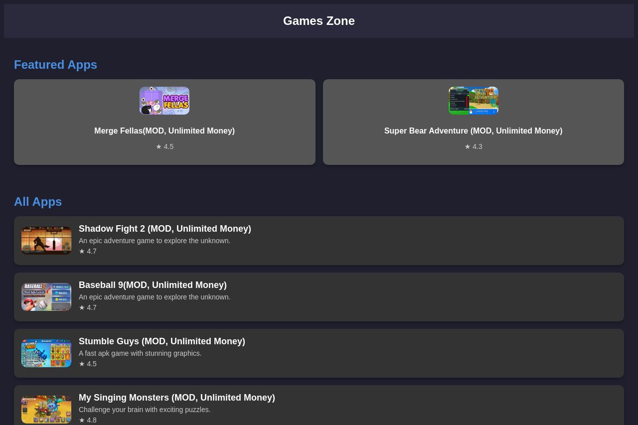
The landing page suffers from a weak visual impact and lack of engaging elements. The layout is repetitive, making it boring and tedious to scroll through the list of apps. All entries look identical, providing zero differentiation or appeal between them. There's an absence of a compelling call-to-action or engaging feature descriptions that might captivate users. Variations in the star ratings are almost unnoticable; both content and style don't engage effectively or entice further exploration. The page is also aesthetically uninspired, sticking to bland color schemes that offer minimal excitement, particularly for a games website.
Main Recommendations:
- Add more engaging visuals and graphics to make the page lively and appealing.
- Use varied fonts and colors for texts to create a more dynamic visual hierarchy.
- Incorporate more specific and captivating descriptions for each app to highlight unique features.