co.uk
Landing Page Analysis
Flarin
60

Generated on:
June 16, 2025Score:
60/100Audience:
shoppersShare on:
Summary:
60
Messaging
60
Readability
50
Structure
40
Actionability
50
Design
80
Credibility
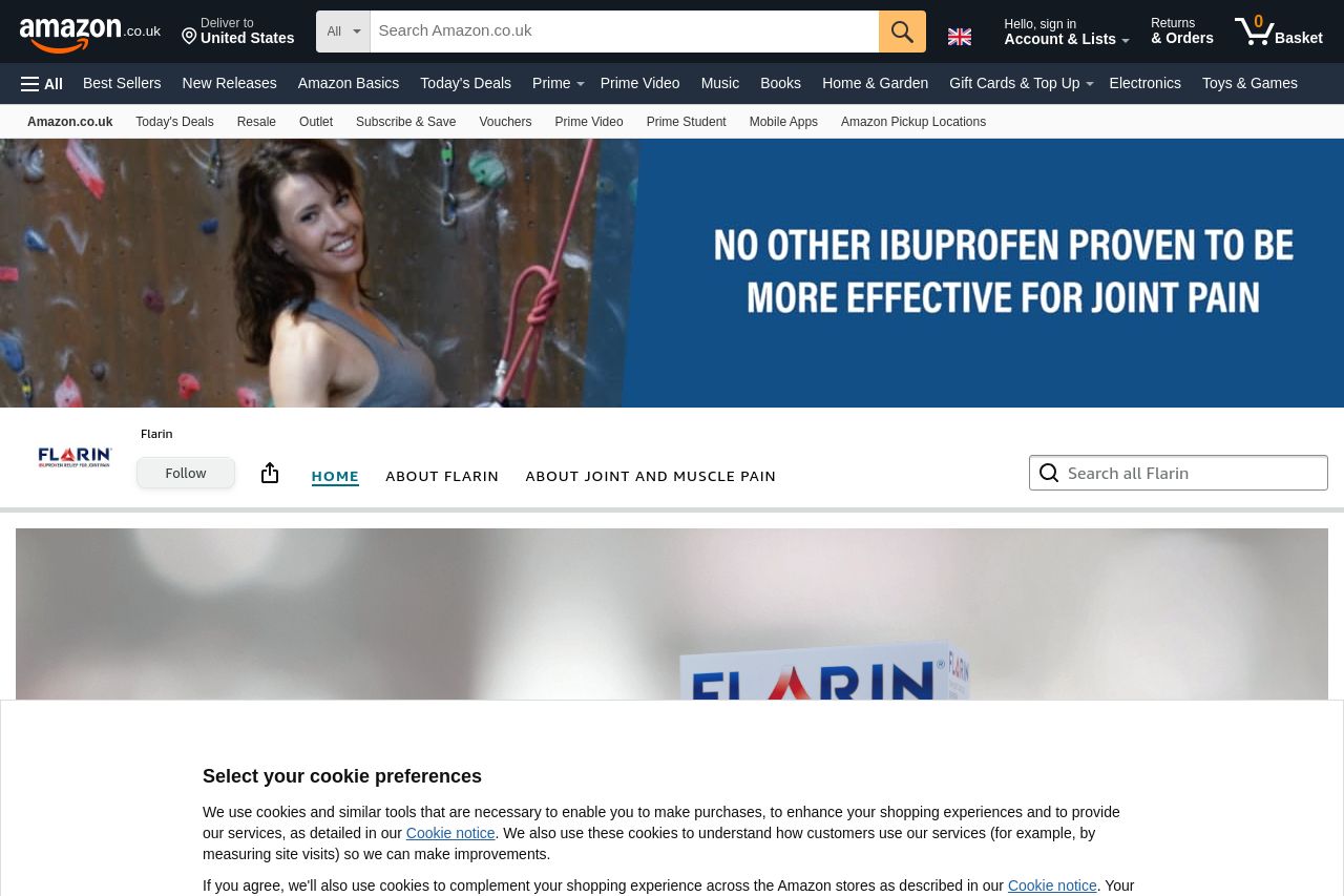
The landing page is cluttered with cookie preferences pop-ups, which are a major distraction. It struggles with providing a clear value proposition, as the statement "No other ibuprofen proven to be more effective for joint pain" stands out but lacks immediate cohesive messaging that aligns with the brand's features and benefits. The typography is generally readable, but the design is inconsistent with contrasting sections that don’t align visually. The testimonials are a strong point, yet they are overshadowed by the lack of an organized structure. The imagery feels random and not thoughtfully integrated with the messaging. CTA elements lack urgency and clear directives, failing to guide the user efficiently.
Main Recommendations:
- Simplify the design to improve coherence and reduce the impression of clutter.
- Enhance the CTA by making them more specific and action-oriented.
- Improve the image integration to align more closely with the text content.