acris.ai
Landing Page Analysis
Create AI agents in plain English with our no-code platform. Connect 2500+ apps, automate workflows, and build AI solutions in minutes.
Summary:
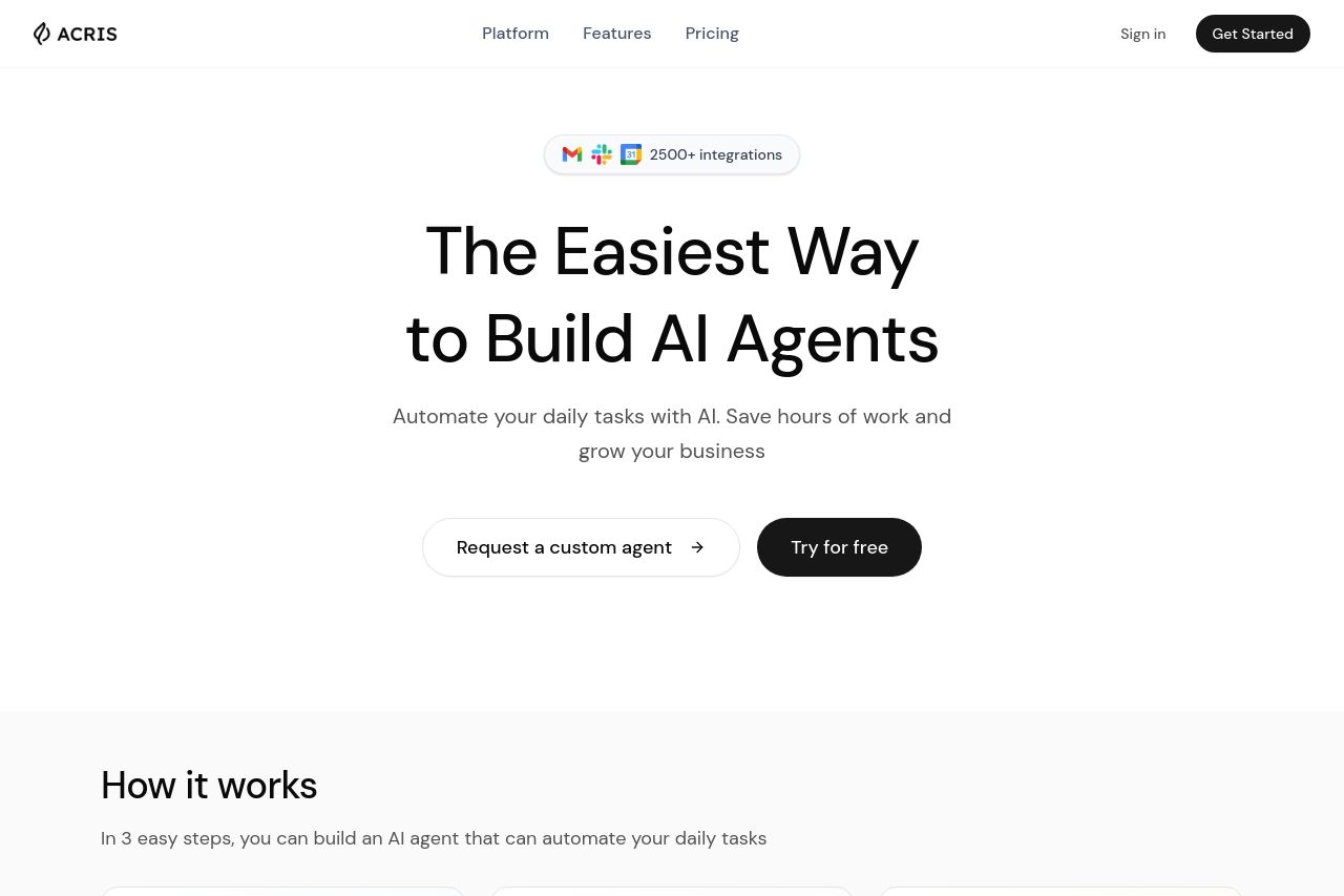
Overall, the page effectively communicates its core offerings and makes a good impression with its structured layout and clear messaging. The main headline, "The Easiest Way to Build AI Agents," efficiently conveys the primary value proposition right away. There's a prominent use of separation between sections ensuring a logical reading flow. The design employs consistent color usage, primarily in black and white, which keeps the focus on the content.
However, the section "Results from our Customers" could use more engaging visuals or testimonials to enhance credibility. The pricing section is clear, but a visual comparison may help clarify options without needing to read through each column. Additionally, while the CTAs are easy to spot, the language could be more action-oriented to better drive conversions. "Get Started" and "Try for free" are somewhat generic and miss the opportunity to evoke urgency or specific user benefits.
Overall, the site's professionalism and well-organized design work in its favor; however, enhancing social proof and tweaking CTAs could significantly elevate its effectiveness.
- Incorporate customer testimonials or case studies in the 'Results from our Customers' section to boost social proof.
- Revise CTA text to be more action-oriented and specific, such as "Start Building Agents" instead of "Get Started."
- Consider a visual comparison or chart for the pricing section to quickly convey differences.