landinganalyze.com
Landing Page Analysis
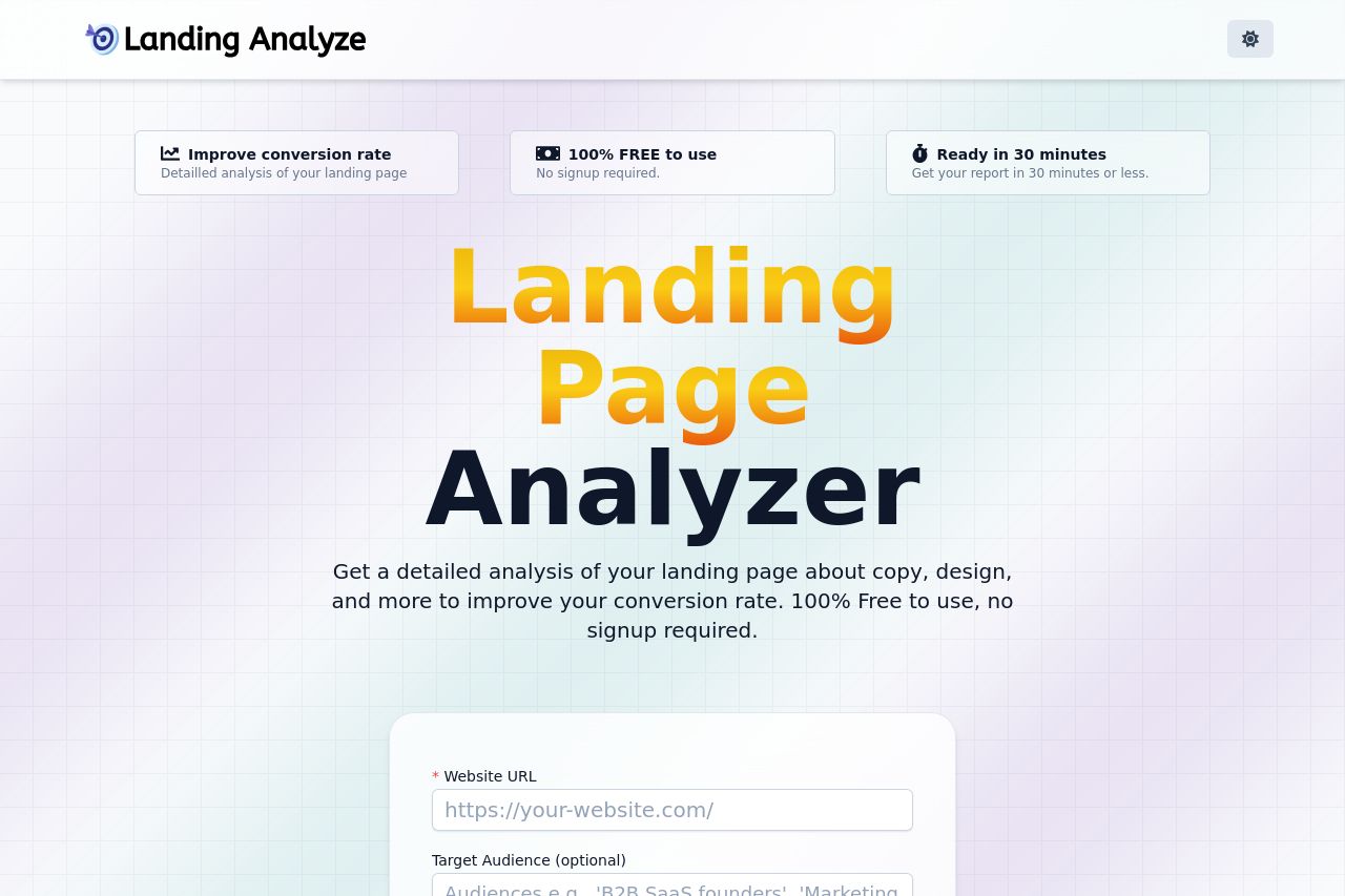
Get a detailed analysis of your landing page about copy, design, and more to improve your conversion rate. 100% Free to use, no signup required.
Summary:
The landing page has a clean and straightforward design, making it easy for users to understand what the tool offers.
The value proposition is prominently displayed with "Landing Page Analyzer," but it could be clearer on specific benefits. Color contrast is decent but lacks excitement or engagement, potentially causing users to lose interest quickly. The call-to-action (CTA) "Analyze my Landing Page” is clear, but it could use a more action-oriented verb to create urgency.
The navigation is straightforward, with a clear FAQ section, but there's repetition in visuals and a lack of impactful content hierarchy. Consistency is maintained well throughout the page, but some elements like the “Latest landing pages analyzed” don’t add much value.
Social proof is missing, which can harm credibility. The single focus on entering a URL is good for driving users down the funnel, though some will want more information before taking action.
- Clarify the specific benefits in the value proposition to enhance user understanding.
- Introduce social proof elements like testimonials or user logos to build credibility.
- Rework the CTA to be more action-oriented and engaging to create urgency (e.g., "Boost Your Conversion Now!").