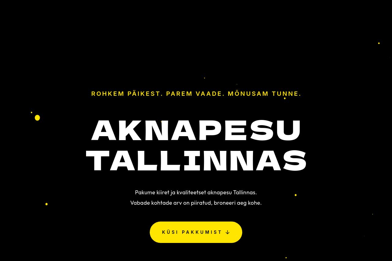
aknadpuhtaks.ee
Landing Page Analysis
Pakume tipptasemel ja mugavat aknapesu Tallinnas.
60

Share on:
Summary:
65
Messaging
60
Readability
70
Structure
40
Actionability
65
Design
40
Credibility
The landing page communicates a clear service offering—window cleaning in Tallinn—with strong use of visuals and consistent color scheme. The black and yellow contrast is eye-catching and helps critical elements like CTAs stand out. However, the page struggles with text-heavy sections that aren't broken up by visuals or clear bullet points, making it hard to digest quickly. Repetitive calls to action aren't effectively varied to guide the viewer based on different parts of the content, losing potential conversion opportunities. In terms of messaging, although clearly defined for a local audience, the specificity of the benefits isn't compelling enough to differentiate from competitors.
Main Recommendations:
- Break text into bullet points for better readability.
- Use varied CTAs that guide users along their journey.
- Enhance visual hierarchy with different font styles and sizes.