supalawn.com
Landing Page Analysis
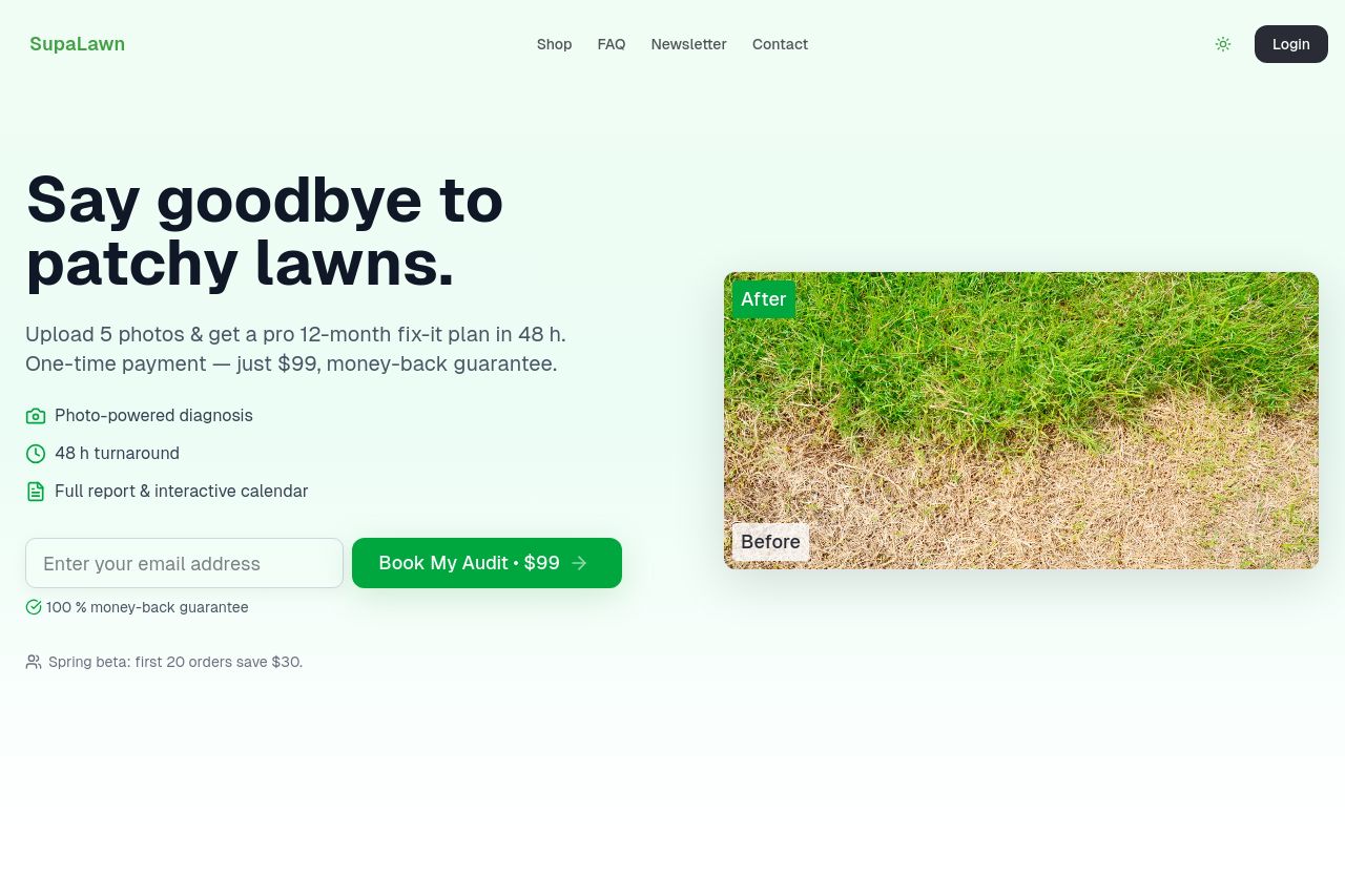
Upload 5 photos & get a pro 12-month fix-it plan in 48 h. One-time payment — just $99, money-back guarantee.

Summary:
The landing page for SupaLawn does a decent job of communicating its core offering with its bold headline, "Say goodbye to patchy lawns," which immediately addresses a common pain point. The imagery of before and after lawns aids in conveying the value proposition visually. However, the design feels a bit plain and lacks dynamic elements that would make it more engaging. The use of a soft green color palette fits the theme but doesn't make important elements pop as needed.
The readability is generally good, but the text tends to be a bit simplistic and could benefit from more compelling reasons why users should trust SupaLawn. The sections are clear but lack a wow factor to keep visitors scrolling. CTAs are action-oriented, but the placement is not strategic enough to capture user attention at each decision point. The credibility is unclear due to the absence of trust elements like testimonials or badges which can undermine the perceived reliability of the service.
Overall, while the page communicates its offer, it feels a bit flat and misses opportunities to engage deeply or build trust with the visitor.
- Enhance the visual design by adding dynamic elements or animations.
- Incorporate customer testimonials to build trust.
- Improve the contrast of the CTAs to make them stand out more.